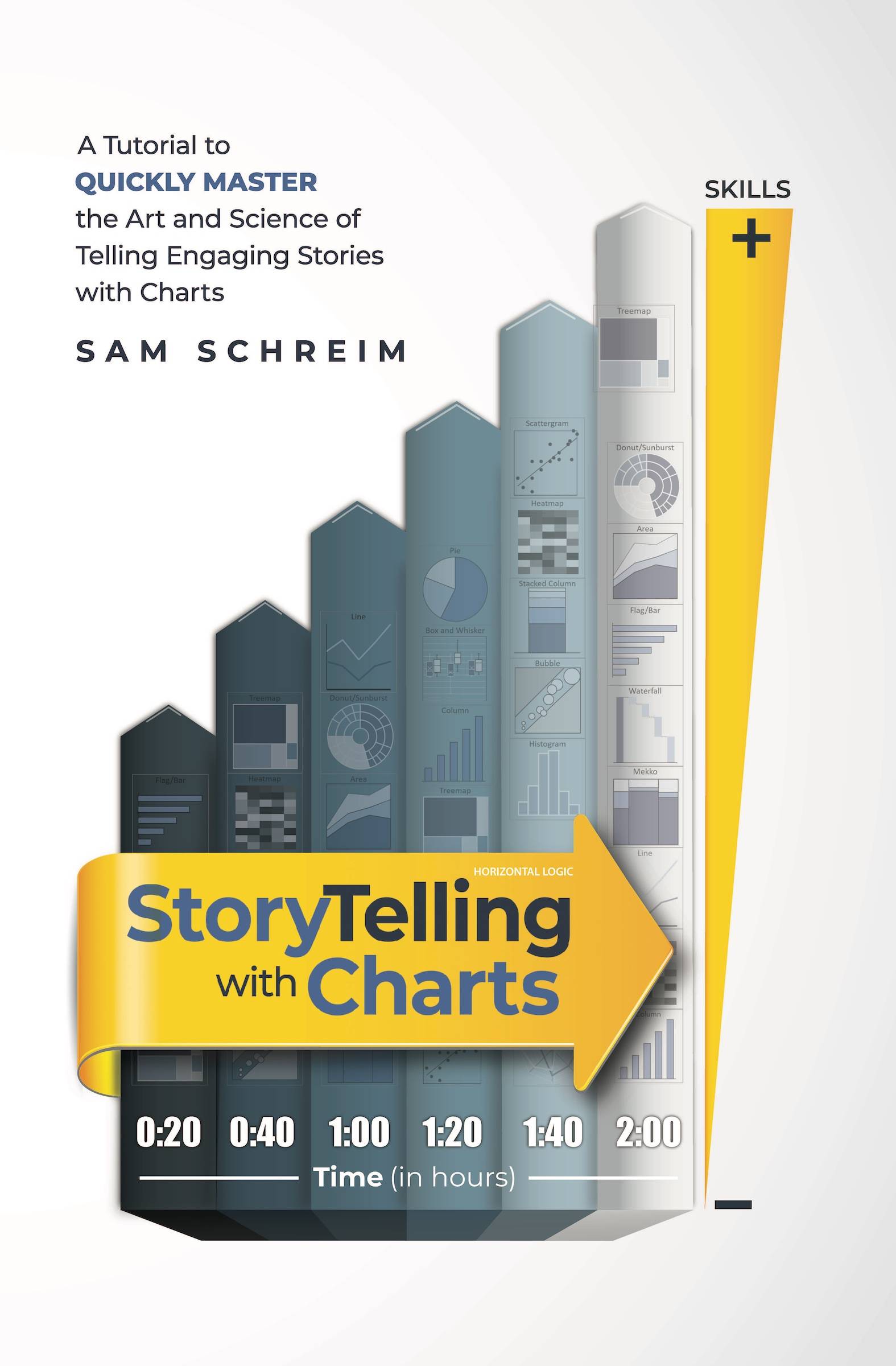
Telling Stories With Charts: A Book for Creating Better Data Visualizations
Data is everywhere these days. From websites to work presentations, charts and graphs are commonly used to visualize data. But not all charts clearly tell the story of the data. A confusing or cluttered chart can obscure the message you want to share.
That’s why Sam Schreim wrote the book Storytelling With Charts. It focuses on principles and techniques to create effective data visualizations that engage your audience.
Who is This Book For?
This book is useful for anyone who works with data and needs to present it visually. It will help you:
- Organize and simplify data to highlight key insights
- Choose the best chart types for your message
- Design clean and intuitive charts that stand out
- Shape data into compelling narratives and storylines
Whether you use Excel or other visualization software, the lessons apply to all chart creation.
Main Topics Covered
The book covers the entire process of developing impactful data visualizations. Here are some of the topics included:
Chapter 1: Visualizing Data
- Principles for visualizing quantitative information
- Avoiding common mistakes like clutter and confusion
- Focusing on the key data stories to showcase
Chapter 2: Chart Types
- matching chart types like bars, lines, pies, and maps to your message
- Guidelines for choosing the right visual display of data
- Examples of good and bad uses for each chart variety
Chapter 3: Storytelling
- Techniques for crafting data narratives
- Turning data into insights through compelling stories
- Ordering and emphasizing data for maximum impact
Chapter 4: Design Principles
- Best practices for clean and intuitive design
- Using color, labels, and other elements effectively
- Creating visually engaging charts and dashboards
Chapter 5: Tools and Templates
- Using Excel and data visualization software like Tableau
- Resources for learning chart creation skills
- Templates and examples to practice with
There are also case studies from real examples that show these principles in action.
Key Lessons and Takeaways
Here are some of the main things readers will learn from this book:
- Data alone doesn’t speak for itself. Visualization and storytelling make data meaningful.
- Simplify charts to highlight the clearest message, removing clutter.
- Use the right chart types for your specific data and narrative.
- Lead your audience through the data to discover insights.
- Design charts to be intuitive and draw attention to key points.
Readers gain skills to organize data, choose effective visual displays, and create compelling narratives. The result is presentations and reports that clearly communicate and engage.
What Reviewers are Saying
“An essential guide to making your data presentations shine. Packed with practical tips and visualization best practices.”
“This book changed how I create charts in my job. My data stories have never been clearer and more powerful.”
“Sam Schreim has provided an invaluable resource for anyone that needs to leverage data visualizations and storytelling.”
“Learning these principles helped me improve the impact of my dashboards and reports tenfold. I frequently refer back to this book.”
“Anyone who creates charts, graphs, and data visualizations should read this. It has improved how I work with data.”
Who is the Author
Sam Schreim is an expert on data visualization and communicating with data. He has consulted with major corporations, media firms, nonprofits, and governments around the world.
His focus is making data presentations resonate and convince, rather than simply display information. The principles in Storytelling With Charts are proven methods to make your data insights understandable, memorable and actionable for any audience.
Take Your Data Presentations to the Next Level
If you work with data, this book will upgrade your skills for creating standout charts, graphs, and dashboards. Storytelling With Charts provides practical guidance grounded in visualization best practices.
Follow the lessons in this book and your Excel charts will become clearer and more powerful. Your data stories will come to life. And you’ll be able to craft compelling narratives that engage your audiences.
This book is a must-read for anyone that works with data. Get your copy of Storytelling With Charts and start making more impactful data visualizations today.
