Data as a Story: How to Use Symbolism, Personification, and Simile to Engage Your Audience
Imagine yourself about to present important data. Do you simply open your laptop and rattle off metrics? Or do you artfully craft a compelling narrative? Savvy presenters know data alone rarely captivates. To connect with audiences, they transform dry statistics into vivid stories brimming with color and emotion.
Let’s explore techniques to turn data points into dynamic story elements that spark imagination and speak to what listeners care about most. We’ll examine how symbolism, personification, simile, and other basic literacy devices can help breathe life into your data.
Make Your Data Symbolic
Leverage your audience’s cultural knowledge by associating data with familiar symbolic motifs. Does a trend evoke traditional symbols of growth like seedlings or ascending arrows? Are losses and declines reflected by downward pointing arrows? Shared symbolic language embeds meaning efficiently.
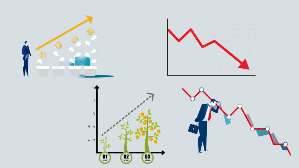
Symbols are powerful tools for communicating complex ideas in a simple and memorable way. They tap into the cultural knowledge of the audience and create associations between data and familiar motifs. For example, if you want to show the growth of a company or a product, you can use symbols of growth like seedlings, flowers, or ascending arrows. These symbols convey the message of progress, development, and success. On the other hand, if you want to show the losses and declines of a business or a market, you can use symbols of decline like downward pointing arrows, broken lines, or red colors. These symbols convey the message of failure, regression, and danger. By using shared symbolic language, you can embed meaning efficiently and make your data more symbolic.
Personify Key Data Points
One way to make your data more engaging is to personify key data points. This means giving human-like qualities or characteristics to the numbers or facts that you want to highlight. For example, if you want to show the impact of climate change on the environment, you can say something like this:
The Earth is crying out for help. She is suffering from a fever that won’t go away. Her glaciers are melting, her forests are burning, and her wildlife is disappearing. Her vital signs are alarming: the carbon dioxide level in the atmosphere has reached a record high of 419 parts per million, the global average temperature has risen by 1.2 degrees Celsius since the pre-industrial era, and the sea level has risen by about 20 centimeters in the last century. These are not just numbers, they are symptoms of a sick planet that needs urgent care.
Data can be boring and dry if you just present it as numbers and charts. But data can also be a story, a story that can captivate and persuade your audience. Another example, if you want to show the performance of a product or a service, you can say something like this:
Meet Bob, the best-selling product of our company. Bob is a smart and friendly device that helps you organize your life. He can do many things for you, such as managing your calendar, sending your emails, playing your music, and more. Bob is very popular among our customers, who love his features and design. In fact, Bob has sold over 10 million units in the last year, making him the leader in his category. Bob is not just a product, he is a friend.
By personifying key data points, you can make your data more relatable and emotional.
Imagine your sales figures, web traffic, or other data points as people with personalities reflecting their attributes. Give them names, quirks, and even backstories. Turn your presentation into a conversation between lively characters. This technique quickly allows audiences to relate to abstract data in human terms.
Craft Similes Using “Like” or “As”
Similes are a type of figurative language that shows how two things that are different have something in common. They use words such as “like” or “as” to make a comparison. For example, if you want to describe how the profits last quarter dropped dramatically, you could say they fell off a cliff like a base jumper from a ledge. Or if you want to illustrate how the website traffic increased rapidly, you could say it roared in as forcefully as floodwaters into a canyon. Similes make your writing more vivid and interesting by connecting the unfamiliar to the familiar.
Other examples:
- revenue soared like a rocket, reaching new heights every month
- profit loss was as clear as day, showing a red line that dipped like a roller coaster
- sales report was as dull as dishwater, showing no growth or improvement for the past year
- profit loss was as shocking as a bolt of lightning, revealing a huge gap between the expected and actual results.
Use Imagery and Sensory Details
One way to make your data more memorable is to use vivid sensory details that activate the brain’s visual cortex. This means that you should describe the trends and patterns in your data using imagery that appeals to the five senses: sight, sound, smell, touch, and taste. By doing this, you can make your audience feel that they are experiencing the data firsthand, rather than just looking at numbers and charts. Imagery sticks better than abstract numbers alone because it creates a stronger emotional connection and a more lasting impression. For example, instead of saying that the sales increased by 10%, you could say that the sales blossomed like a flower in spring, filling the air with a sweet fragrance. Or instead of saying that the customer satisfaction decreased by 5%, you could say that the customer satisfaction soured like a glass of milk left in the sun, leaving a bitter taste in the mouth.
Tell Colorful Stories

Structure your data as a narrative with setting details, characters, and a compelling plot. Introduce challenges overcome and questions answered. Build rising action and a climax highlighting insights revealed. Stories, not sterile statistics, capture attention while imparting meaning. Be the bard that transforms data into legend.
Use Repetition and Metaphor
One way to make your data more memorable is to use metaphors and motifs that you repeat throughout your presentation. Metaphors are figures of speech that compare two different things to show a similarity. Motifs are recurring images, words, or symbols that support a theme. For example, if you want to compare your company to a plane, you can use metaphors and motifs related to flying, such as trajectory, turbulence, destination, etc. By repeating these metaphors and motifs, you can reinforce the key data relationships and help your audience understand the complex ideas. Repeating metaphors and motifs is like singing a catchy song, it makes your data stick in your audience’s mind.
Provide Emotional Connection

Make your data more memorable to provide an emotional connection. This means that you should emphasize how the data affects real people, from customers to staff. Does it indicate happier shoppers, healthier employees, or better community engagement? Identify the human experience within the data. Statistics become far more compelling when audiences connect emotionally. For example, instead of saying that the customer retention rate increased by 15%, you could say that the customers loved our products and services so much that they came back for more, becoming loyal fans and advocates. Or instead of saying that the employee wellness program reduced absenteeism by 10%, you could say that the employees felt more energized and motivated to work, enjoying a better work-life balance and a healthier lifestyle. By providing emotional connection, you can make your data more meaningful and persuasive.
Apply Strategic Contrasts
This means that you should highlight the significant data by comparing it with contrasting data. For example, you can visualize the website traffic surges against previous dips to show how much it has improved. Or you can present the regional sales against national averages to show how well or poorly they are performing. Contrast focuses attention on differences that spotlight your main points. For example, instead of saying that the website traffic increased by 50%, you could say that the website traffic jumped from a low of 10,000 visitors per month to a high of 15,000 visitors per month, showing remarkable growth. Or instead of saying that the regional sales were $100,000, you could say that the regional sales were $100,000, which was twice as much as the national average of $50,000, showing a competitive edge. By applying strategic contrasts, you can make your data more clear and convincing.
Guide Audience Perspective
Storytellers steer perspective through word choice and phrasing. For example, “we” engages audiences as participants while the third-person voice distances them as spectators. Share viewpoints that make the data narrative more immediate, drawing listeners into the story. For example, instead of saying that the company achieved its goals, you could say that we achieved our goals together, making the audience feel part of the success. Or instead of saying that the customers were satisfied with the product, you could say that you were satisfied with the product, making the audience feel like they are the customers. By using storytelling techniques, you can make your data more personal and appealing.
Add Colorful Touches
Statistics alone seem one-dimensional. Use descriptive language to add color, tone, and texture. Incorporate rhetorical asides, idioms, metaphors, humor, and conversational speech. Describe data as if spontaneously speaking to a friend, not presenting formally. Lively language makes data presentations far more engaging and memorable.

Remember, behind the data are human stories waiting to be told in a way that informs, delights, and inspires. Approach your next presentation not as a data delivery vehicle, but as an opportunity to create an unforgettable narrative. Master storytellers don’t just present statistics – they unveil meaning. Let’s get started bringing your data to life!