Master the Art of Storytelling with Charts
Turn boring data and text into an exciting story! Keep reading to master the art of storytelling with CHARTS — A PROVEN, logic-based approach for business professionals and non-professionals!

Storytelling is a timeless art that captivates and engages audiences. Whether it’s a bedtime story, a movie, or a business presentation, storytelling has the power to convey messages effectively and leave a lasting impact. In the world of data visualization, storytelling plays a crucial role in making complex information accessible and understandable. This article explores the concept of storytelling with charts and provides insights on how to create compelling narratives through visual data representation.
Understanding the Role of Charts in Storytelling
Charts are powerful tools for storytelling because they enable the transformation of raw data into meaningful insights. Visual communication has a profound impact on human cognition, allowing us to process information more efficiently and retain it better. When used strategically, charts can simplify complex data, highlight patterns, and convey messages in a visually compelling way. There are various types of charts that can be used for storytelling, such as line charts, bar charts, pie charts, scatter plots, and more. Each chart type has its strengths and can be employed based on the nature of the data and the story being told.
Elements of effective storytelling with charts
To effectively tell a story with charts, several key elements should be considered. First and foremost, choosing the right data is crucial. The data should be relevant to the story you want to convey and support the main message. Additionally, designing visually appealing charts is essential. This involves using appropriate colors, fonts, and layouts to create aesthetically pleasing visuals that engage the audience. Moreover, incorporating a narrative structure helps guide the viewer through the data, ensuring that the story unfolds in a logical and coherent manner.
Using charts to convey a clear message
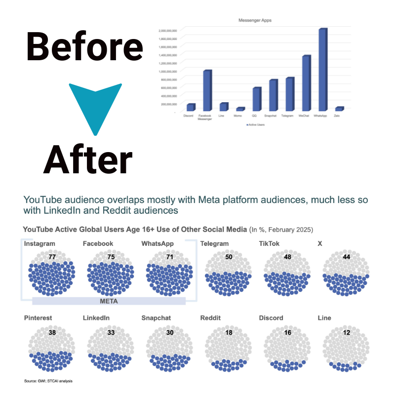
The primary goal of storytelling with charts is to convey a clear and concise message. Complex data can often be overwhelming, so it’s important to simplify it without sacrificing its integrity. By selecting the most relevant data points and using appropriate chart types, you can distill complex information into easily digestible visuals. Additionally, highlighting key insights within the charts allows the audience to grasp the main takeaways quickly. Using annotations, captions, or callouts can draw attention to significant points and provide context for better understanding.
Enhancing storytelling with interactive charts
Interactive charts take storytelling to the next level by allowing the audience to engage with the data actively. They enable exploration, providing users with the ability to interact and uncover insights based on their interests. Interactive elements like tooltips, filters, and zooming capabilities enhance the audience’s involvement, making the story more immersive and memorable. Furthermore, interactive charts offer the opportunity to provide additional context and alternative perspectives, ensuring a comprehensive understanding of the data being presented.
Best practices for creating impactful charts
To create impactful charts for storytelling purposes, several best practices should be followed. Consistency in design ensures a coherent visual experience throughout the narrative. Using consistent color schemes, typography, and chart styles creates a cohesive story and reinforces the message. Additionally, using color and typography effectively can emphasize important data points and create a visual hierarchy. It’s crucial to consider accessibility as well, ensuring that the charts are accessible to individuals with visual impairments by providing alternative text and considering color contrast.
Examples of successful storytelling with charts
Numerous examples demonstrate the power of storytelling with charts. For instance, in a healthcare context, charts can be used to showcase the impact of a particular disease over time, highlighting the effectiveness of interventions. In a business setting, charts can be employed to illustrate market trends, sales performance, or customer satisfaction. Case studies and real-world examples provide inspiration and practical insights into how charts can be leveraged to tell compelling stories across different industries and domains.
Conclusion
Storytelling with charts is an art that combines data visualization and narrative structure to convey compelling messages. By choosing the right data, designing visually appealing charts, and incorporating storytelling principles, you can create impactful narratives that engage and inspire your audience. The effective use of charts simplifies complex information, highlights key insights, and enhances understanding. By embracing interactivity and following best practices, you can elevate your storytelling with charts and create immersive experiences that resonate with your viewers.


