Mastering Data Visualization: Unlocking the Power of Visual Information
Introduction
In the modern era of data-driven decision-making, data visualization plays a pivotal role in enabling organizations to gain insights, communicate information effectively, and drive meaningful actions. It goes beyond mere aesthetics and serves as a powerful tool for presenting complex data in a simplified and engaging manner. We understand the significance of mastering data visualization, and in this article, we will guide you through the process of unlocking the power of visual information.
The Importance of Data Visualization
Data visualization offers numerous benefits that enhance our understanding and interpretation of data. Here are some key reasons why mastering data visualization is crucial:
1. Enhancing Data Comprehension
Visualizing data allows us to comprehend complex information more easily. By representing data visually, we can identify patterns, trends, and outliers at a glance, making it simpler to extract valuable insights and make informed decisions.
2. Facilitating Effective Communication
Visuals have a remarkable impact on communication. Data visualization enables us to convey information clearly and succinctly, making it accessible to a wider audience. Complicated datasets can be transformed into compelling visual narratives that engage and inform stakeholders across various domains.
3. Uncovering Hidden Patterns and Relationships
Through interactive and exploratory visualizations, we can uncover hidden patterns and relationships that may not be apparent in raw data. This empowers us to make discoveries, identify correlations, and gain a deeper understanding of the underlying phenomena.
Key Principles of Effective Data Visualization
To create impactful data visualizations that resonate with your audience, it is essential to adhere to certain principles. Here, we present some key guidelines to help you craft compelling visualizations:
1. Understand Your Audience
Before embarking on any data visualization project, it is crucial to understand your target audience. Consider their level of expertise, domain knowledge, and specific requirements. This will guide your design choices and ensure that the visualizations effectively convey the intended message.
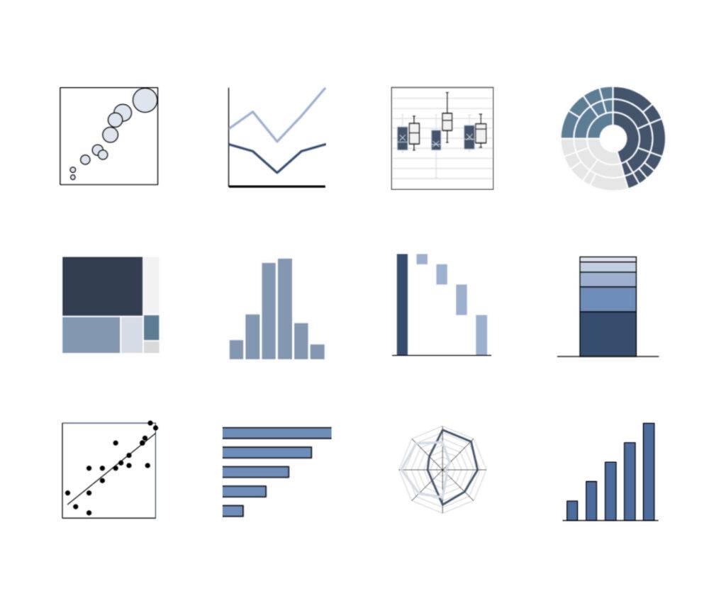
2. Choose the Right Visualization Techniques
There is a wide array of visualization techniques available, ranging from bar charts and line graphs to heatmaps and network diagrams. Selecting the appropriate visualization type depends on the nature of the data and the insights you wish to communicate. Each technique has its strengths and limitations, so choose wisely.
3. Emphasize Simplicity and Clarity
Simplicity and clarity are paramount in data visualization. Avoid cluttering your visuals with unnecessary elements and excessive details. Strive for minimalism, focusing on the core message you want to convey. Use concise labels, intuitive color schemes, and appropriate scaling to ensure your visualizations are easy to understand and interpret.
4. Tell a Story with Your Data
The most compelling data visualizations tell a story. Create a narrative that guides your audience through the data, presenting key findings and insights in a logical and engaging manner. Consider the flow of information and leverage visual elements to support the overarching story you want to convey.
Recommended Tools for Data Visualization
To assist you in mastering data visualization, we recommend utilizing the following tools and technologies:
Tableau: Tableau is a powerful data visualization platform that offers a range of intuitive features for creating interactive and visually appealing dashboards. Its drag-and-drop interface enables users to explore and analyze data effortlessly.
D3.js: D3.js is a JavaScript library that provides a flexible framework for creating custom data visualizations. It offers extensive support for various visualization techniques and allows for fine-grained control over the design and interactivity of your visualizations.
Power BI: Power BI is a business analytics tool that enables users to create interactive reports and dashboards with ease. It provides a user-friendly interface and offers seamless integration with other Microsoft products.
Conclusion
Mastering data visualization is a journey that empowers individuals and organizations to derive actionable insights from complex datasets. By understanding the importance of data visualization, following key principles, and utilizing appropriate tools, you can unlock the power of visual information and make informed decisions that drive success.
Above is a suggested diagram in Mermaid syntax showcasing the interconnectedness of data visualization, comprehension, communication, and insights. Utilize this visual aid to further enhance your understanding of the concepts discussed.
At STC, we are dedicated to helping you harness the true potential of data visualization. Contact us today to embark on a journey toward unlocking the power of visual information in your organization.