Best Practices for Data-Driven Storytelling with Charts and Graphs
Data-driven storytelling has turned into a key part of making decisions across different fields. Using tools for visualizing data, such as chart and graph makers, improves how we share and understand complicated information. In this article, we discuss the best tips for effective data-driven storytelling. We will look at how to use charts and graphs to share information clearly.
Understanding the power of data-driven storytelling
Data-Driven storytelling blends the power of analysis from numbers with the emotional influence of a good narrative. Begin by comprehending what tale your data is telling, finding patterns, trends and things that stand out. This foundational step helps in shaping a coherent narrative that resonates with your audience. To get at the heart of your data story, you must sift through the details with curiosity to understand what’s meaningful. Run different analyses, visualize the data from various angles, look for any surprises or open questions that emerge. The data will only speak for itself initially – you sometimes have to listen patiently and probe more deeply for those impactful insights.
Choosing the right chart or graph
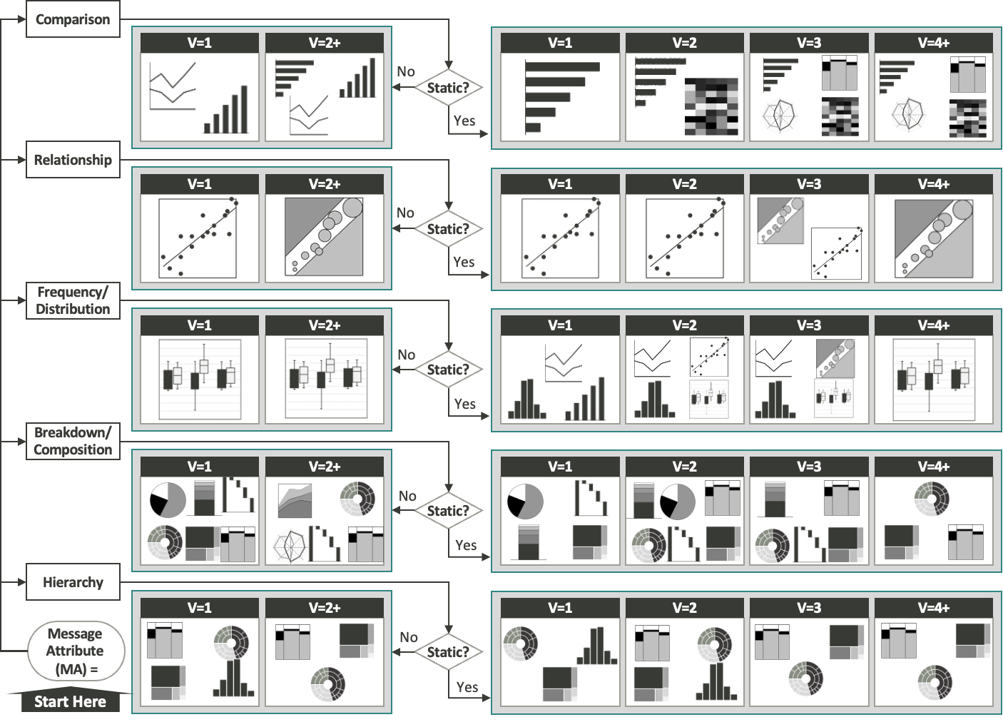
Choosing the right chart or graph is very important to show your message clearly. Bar charts work well when you want to compare things, line charts are good for showing changes over time, and pie charts help to demonstrate pieces of a whole thing. Use a chart maker and a graph maker with many choices, so you can pick the most suitable way to show your data.
With all the options out there, it can get overwhelming trying to select the ideal visual. But let your story guide the way – think about the patterns and relationships you want to highlight and what would make them most obvious. Keep the complexity of the chart fitting for your audience too. You want readers to instantly comprehend the main takeaway, not feel bogged down deciphering complex graphics.
Simplify complex data
Make sure not to give your audience too many complicated diagrams that might make them puzzled instead of helping them understand. Make the complex information simpler by dividing it into small, easy-to-understand parts. Apply different colors, notes, and symbols to emphasize important details and direct the reader’s understanding of the data.
When you’ve got a dense dataset with multiple variables at play, it’s kinda like staring at a messy tangle of knotted yarn – it just looks overwhelmingly complex. Don’t get discouraged! There’s usually a clever way to carefully pull at the right threads and break it down step-by-step so the key patterns come through. It takes some work to translate complexity into simplicity, but a little creative presentation finesse goes a long way.
Consistent design and branding
Keep a uniform style and branding across the data visualization. It makes them look better and also strengthens the recognition of your brand. Select a set of colors that matches your brand identity and apply it uniformly throughout all the charts and graphs. You want your charts and graphs to feel cohesive, like a matching set, right down to font choices and where axes labels are placed. This creates a visual flow for readers through your data story. It also subconsciously reinforces your style or your organization’s branding, so folks intrinsically associate those color schemes and design motifs with you whenever they spot them.
Tell a compelling story
Make a story from your data that holds the attention of your listeners. Begin with an easy-to-understand introduction, show the most important results, and finish with insights people can use. Strategically use data points to back up your story, making sure there is a smooth transition from one fact to another.
Crafting a narrative arc from charts and graphs is like directing – you control the data-driven scenes to take your audience on an insightful yet digestible journey. Sequence the flow thoughtfully, starting with a framing hook before transitioning into rising action, highlighting notable trends and relationships through climactic vertices and data peaks.
Interactivity for engagement
Use the interactive parts that a graph maker gives to captivate your audience. Things like details when you hover or parts you can click on make the experience better for users, letting them look into the data as they prefer. Building those interactive elements that encourage audiences to engage with charts actively allows them to get hands-on, satisfying personal curiosity by self-navigating the data highlights at their own pace.
Data accuracy and transparency
Keep your data’s integrity by being accurate and transparent. Label your axes clearly, list where you got the data from, and don’t create visuals that can confuse or deceive others. Being transparent about your data sources and methodologies builds trust with your audience.
Emphasize key insights
Highlight key insights by using visual cues such as bold colors, annotations, or callout boxes. Draw attention to critical data points that support your narrative, helping your audience grasp the significance of the information presented. Strategically magnify sections that might get overlooked at a glance. It’s about deliberately directing focus so significant bits don’t blend into the visual landscape. Even if you’ve structured superb data charts, nuanced insights can still be hidden in plain sight.
Tailor to your audience
Consider your audience’s familiarity with data and adjust your storytelling approach accordingly. Provide explanations for complex terms, and choose visualizations that resonate with your audience’s preferences and understanding.
Utilize advanced visualizations
Look into more complex ways of visualizing data beyond just the usual graphs and charts. Using heatmaps, treemaps, or radar charts might give you new insights into your information. Experiment with these visualizations to uncover new insights and present data in innovative ways.
Contextualize data with external factors
Enhance the richness of your narrative by incorporating external factors that contextualize your data. Consider economic indicators, market trends, or social influences that may impact the data presented. Providing a broader context helps your audience better understand the implications of the information.
Employ data predictions and forecasting
Incorporate the use of predictive analytics and forecasting in data-driven storytelling. By using these models, you can provide an additional perspective that looks ahead, helping your audience to see what might come next and make decisions early based on what is expected in the future.
Customize for different platforms
Adapt your visualizations for different platforms and mediums. Whether presenting on a large screen during a conference or through a mobile device, ensure that your charts and graphs are optimized for the specific platform. Consider responsiveness and clarity to guarantee a consistent experience across diverse devices.
Collaborate with data experts
Work together with experts in data and analysis to make your story based on data more accurate and detailed. Have conversations with them so that the way you tell your narrative matches the subtle details of the information you use.
Conclusion
To be good at data-driven storytelling using charts and graphs, you need to mix your skill in analyzing with a talent for explaining things well. When you know your data well, pick the best ways to show it visually, and follow the guidelines for doing so effectively, you can make powerful narratives. Use the strength of data visualization tools, follow these suggestions, and begin a journey to change basic data into powerful narratives that lead to actions. For further insights on data-driven storytelling, make sure to get your copy of Storytelling with Charts.