Flag Charts Unveiled: Mastering Data Anomalies
There are many different ways to display data, yet the flag chart remains one of the least used and, therefore, least known about. However, it is a powerful way to showcase data, particularly to highlight exceptions and anomalies with greater clarity. As you learn more about storytelling with data, you’ll quickly understand how useful these types of charts are, alongside other skills such as how to add graphs to a PowerPoint presentation. All of this allows you to showcase information to your audience, keep their attention where you want it to be, and allow them to understand the key takeaways.
In this guide, we’ll explore flag charts, what they’re used for, how to create the most effective ones, and everything else you need to know to utilize this underestimated yet extremely powerful visualization tool.
Table of Contents
- The Origins and Evolution of Flag Charts
- The Anatomy of Modern Flag Charts
- Implementing Flag Charts in Modern Data Analysis
- The Future of Flag Charts in Data Storytelling
- Advanced Flag Chart Construction Techniques
- Psychological Foundations of Flag Chart Effectiveness
TL;DR
- Flag charts originated as a visual tool to represent categorical or geopolitical data, evolving alongside cartography and data visualization practices.
- Modern flag charts are composed of standardized symbols, colors, and spatial arrangements to enhance readability and interpretability.
- In contemporary data analysis, flag charts are used to quickly compare multiple entities across several metrics.
- The future of flag charts lies in interactive and dynamic formats, integrating real-time data and personalized storytelling.
- Advanced construction techniques include layering contextual cues, optimizing for screen vs. print formats, and using algorithmic generation.
- Their effectiveness is rooted in cognitive psychology, especially visual memory and pattern recognition.
The Origins and Evolution of Flag Charts
Before you can learn to effectively use flag charts, it’s interesting to understand where they came from and how they have arrived to be the data visualization tools we know today. From battlefield mapping to naval navigation and beyond, flag charts have certainly come a long way. Let’s explore their journey in greater detail.
Historical Roots in Military Strategy
Flag charts have their roots in the military, highlighting why these charts are designed to highlight exceptions, as opposed to continuous data like some other charts. Throughout history, military leaders needed to find a tool that could draw attention to both threats and opportunities, and they found that flag charts ticked the correct box. Even today, modern flag chart design shows that the main goal is to drive attention to the most important point, particularly in very complex groups of data. In fact, the earliest flag charts appeared during times when commanders needed to track several units at any one time. These charts were certainly primitive, but they formed the foundation of what we see today. At the time, charts used the concept of using marker position to encode both categorical and temporal information simultaneously.
Naval Navigation Applications
As time moved on, flag charts were used in maritime navigation, particularly in the 18th century. At this time naval commanders had to track ship positions, enemy movements, and keep a close eye on the wind. Using colored flags on maps, they could mark positions and weather conditions, principles that we still see in flag charts today.
Industrial Revolution Adaptations
Flag charts continued to develop throughout the Industrial Revolution, where they moved away from military uses to commercial means. In this case, factor managers adapted these charts to track quality control issues, production schedules, and allocation of resources. This development helped cement flag charts in their place as a valuable monitoring tool within complex processes, especially when identifying deviations away from the norm.
Before we move on, read our article on how to communicate quantitative analysis effectively to understand more about highlighting deviations in data.
Integration with Statistical Process Control
As the 20th century arrived, flag charts had begun being integrated with statistical process control methods in the manufacturing industry. This took the flag charts from a simple visual market to a complex quality management tool. At this time, flags became visual indicators of when processes went above statistical ontrolimit,. This allowed factory managers to quickly spot any issues with the production routine and monitor processes with greater ease.
Transportation Scheduling Systems
The next step took flag charts even further, utilizing them in transportation scheduling systems. In this case, they were used to visualize complex operations, and to flag highlight route conflicts, resource allocation issues, and delays. At the same time, the temporal nature of flag charts allowed them to show their value, showing both actual performance and scheduled time in just one chart. From there, deviations can be quickly spotted.
The Anatomy of Modern Flag Charts
We’ve looked at the history of flag charts, now let’s understand where they are today. These days, flag charts are sophisticated tools for visualization with their own specific components. The first step to mastering these charts is to understand their structure.
Core Structural Elements
Flag charts all contain specific components that form their basis and these then work together to create a data story. The baseline axis is the starting point, providing sequential or temporal context. It should be visually subdued but still clear, and it’s usually horizontal. Next, the flag markers highlight anomalies or exceptions and they should stand out with clear colors or shapes for different types. Threshold indicators show acceptable ranges and their deviations, often shown by horizontal lines or bands with different color gradients. These are followed by reference points that show comparison against benchmarks. These can be represented as special markets or secondary lines. Finally, annotations explain significant exceptions and these should always be positioned to avoid obscuring data and be concise.
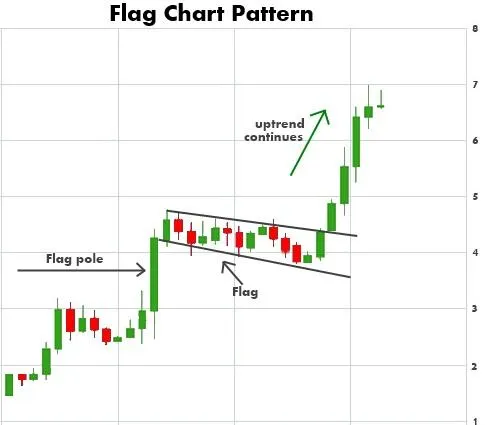
Flag charts exhibit specific patterns that give information about deviations from the norm.
Source: stockgro.club
Flag Chart Variations and Their Applications
There are many specialized flag charts that can be used for specific contexts. For instance, bi-directional charts show both positive and negative deviations, while multi-series charts can show exceptions across various categories. Density-based charts are particularly useful when dealing with high-volume data.
Each of these variants offers pros and cons, and it’s important to choose the right one so you can highlight the insights most important to your audience. Our article on choosing the right chart or graphic for your data is a great place to find more information on this.
Bi-Directional Flag Charts
A bi-directional flag chart extends above and beyond the baseline, so they’re a good option for showing both positive and negative deviations from a central norm. These charts are often used by financial analysts, especially those who want to track stock performance against benchmark indices, perhaps to highlight when budgets have gone over or under.
Multi-Series Flag Charts
This type of chart is helpful when you have several data series that need to be compared. In this case, you can use pattern differentiation or color-coding to show the difference categories. This type of chart is excellent for showing correlations between anomalies that move across different yet still related data sets. For instance, this chart could be used in manufacturing quality control to show exceptions in speed or pressure.
Density-Based Flag Charts
Another type of flag chart is density-based, which is used in situations when there are several data points. In this case, adjusted flag widths or opacities can be used to showcase frequencies or magnitudes of anomalies. This type of chart is ideal for reducing cognitive overload, and is useful for high-frequency data such as network monitoring or stock market transactions.
Design Principles for Effective Flag Charts
When designing a flag chart, it’s important to make it as impactful as possible. You can do that by balancing information with visual clarity, using colors and visual hierarchies to guide attention to where you need it to be first. You can also use negative space strategically, creating a rhythm that shows patterns more clearly. Let’s explore some interesting points that you can use to create an impactful and easy-to-follow flag chart for your audience’s needs.
Color Psychology in Flag Selection
Color theory is certainly alive and well in flag charts, and the principles can be used to help create intuitive and visually appealing charts and hierarchies. Important deviations tend to use warm colors, such as reds and oranges, while less important ones can use cooler shades. It’s also important to ensure your charts are accessible for colorblind individuals, combining color with clear shapes or patterns so everyone can read your chart.
Negative Space Utilization
Careful of negative space can help make your flag charts more impactful. Even if you have spaces with no flags, this can be just as informative as if you had them everywhere, and it helps to create a visual rhythm that pulls your audience’s attention to important anomalies. Using space in this way helps to reduce cognitive load, asi t allows the human eye to quickly and easily spot where exceptions are, without having to look at every single data point.
Implementing Flag Charts in Modern Data Analysis
It’s true that flag charts are less common than pie charts, bar charts, or even line charts, but that doesn’t mean they’re any less effective. When used for their specific talents, e.g., highlighting exceptions and anomalies, they’re extremely powerful. However, implementing them effectively requires time, effort, and a clear understanding of both technical requirements and cognitive principles. Let’s explore all of this now.
Technical Implementation Steps
The first step to creating a clear and effective flag chart is starting with clean data and having clear ideas on what defines an exception. This will ensure that your flags highlight meaningful information rather than any issues with data quality. When choosing software, remember to consider both creation and your intended interaction and distribution method for the final information. Following a careful starting structure means that your flag chart will highlight patterns and anomalies specific to your analysis.
When doing this, remember to discard any outliers that may accidentally distort the information and establish defined thresholds. From there, create a derived column that calculates deviations from your expected values, with appropriate time intervals for the baseline axis. These are the foundational steps that form the basis of your chart.
Software Selection and Configuration
Flag charts can easily be made with specialized visualization tools or with other software packages. For instance, Excel is an accessible approach that uses conditional formatting through custom data bars and markets. You can also consider programming languages such as R or Python, which offer more customization options. Business intelligence platforms like Power BI and Tableau are also up for discussion, providing easy-to-use interfaces with interactive capabilities. Whichever you choose, remember that you should always balance technical elements with your current skills and tools.
Of course, the Storytelling With Charts plugin should certainly be on your radar. We designed this to help you create attractive, clear, and impactful charts, and it’s totally free of charge. Yes, you read that right. With customizable features and a huge range of charts, it will help you create data visualization options your audience will enjoy.
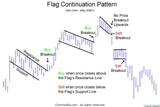
Flag charts are an excellent way to highlight anomalies within a complex dataset.
Source: commodity.com
Cognitive Aspects and User Experience
When creating flag charts, it’s critical to understand that it’s not all about technicalities but also about how it can be understood by the audience and the underlying cognitive processes that every human experiences. Understanding preattentive processing in particular can help you boost your visual elements for pattern recognition, easing stress in your audience’s minds.
Preattentive visual processing is the brain’s ability to notice and recognize visual details without any conscious effort. You can leverage this by using length and position as the primary encoding methods, as these are the most easily perceived by the human brain. Using color to highlight categorical differences is key, as opposed to quantitative values. Additionally, remember to isolate important flags by contrasting them in size, color, and shape. Minimizing background elements can also cut down on visual stress, so you don’t have other elements competing against one another.
Contextual Framing
You can boost understanding by giving as much context around your flags as possible. To do this, include references information like historical averages or industry benchmarks which can help your audience interpret exception significance more clearly. Annotations can be added for exceptional flags, explaining why they’re so important. Another option is to graph related flags together using connecting elements or simply by proximity, along with a cear legend that explains your entire encoding system.
The Future of Flag Charts in Data Storytelling
Data visualization is an ever-evolving beast, and that means that flag charts are doing the same. From advanced analytical integration to ethical considerations, many things are shaping how flag charts function now and in the future. Let’s take a deeper dive into these trends.
Integration with Advanced Analytics
The flag charts of the future will be enhanced with analytics, and machine learning algorithms will play a part. This technology helps to determine what an anomaly is based on historical patterns rather than static thresholds. An automated root cause analysis also helps explain why flags appear in the first place. We can also talk about natural language generation, which creates narrative explanations alongside visual flags, giving greater context for your audience.
All of these developments look set to change flag charts for the better, making them more innovative and interactive as time goes on.
While we’re talking about the future, our article on the future of data storytelling is a fascinating read and gives some useful tips on what to expect in the years to come.
Emerging Visualization Techniques
Many of the emerging techniques in flag chart creation focus on how two-dimensional options are limiting, and that 3D options may create a more innovative and engaging option. Using virtual reality allows analysts to work through data landscapes and assess flags in different planes. Sonification also complements visual flags with audio cues for real-time monitoring.
We can also talk about collaborative environments that support team-based analysis of highly complex systems. All of this takes flag charts past their traditional options and allows for multi-sensory and highly immersive experience.
Psychological Foundations of Flag Chart Effectiveness
One of the main reasons why flag charts are so effective is their ability to tap into human visual cognition and our general attention mechanisms. If you understand these principles, it will allow you to create more compelling and attention-grabbing charts. Let’s explore these principles in detail.
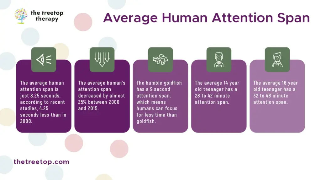
Flag charts are designed to tap into human attention mechanisms.
Source: thetreetop.com
Attentional Trigger Mechanisms
Flag charts make use of visual properties that capture human attention very easily, and that makes them very effective for situations when fast identification of details is important. Transforming data anomalies into visual elements that trigger a response means your flag charts will hold your audience’s attention and the important details won’t be missed, even if the data is complex.
Change Blindness Countermeasures
The human brain tends to struggle with detecting slow changes that happen over time, and this is called ‘change blindness.’ flag charts work against this by transporting small trends or threshold crossings and turning them into distinct visual elements that easily trigger attention. This goes a long way to explaining why people monitoring flag charts usually spot issues much faster than people who simply use traditional line graphs.
Cognitive Load Reduction Through Binary Signaling
Flag charts can help convert complex continuous measurements into binary signals, such as flag or no flag. This can reduce cognitive processing struggles, making them particularly useful in high stress environments where there are many demands at any one time. From this, binary signaling turns what would otherwise be an active and cognitively demanding task and turns it into something more passive and generally more relaxing.
Memory Support Functions
Another cognitive aspect that flag charts can help wth is creating persistent visual records of exceptions, therefore serving as external memory aids. This overcomes the human memory constraints that often occur when attempting to identify patterns that happen over a long period of time.
Contextual Anchoring for Comparative Judgment
Finally, flag charts create visual anchors that can help to support comparative judgments across a range of categories or periods of time. This is because they establish regular visual reference points, and they help analysts make stronger assessments over whether an exception presents improvements or worsening of historical norms. This type of anchoring helps to overcome recency bias that often infects human judgment and distorts it when relying simply on memory for comparisons.
Learnings Recap
Throughout this guide, we’ve talked in detail about flag charts, what they are, what they do, and what they can be used for. It’s clear that these are powerful visualization tools designed to highlight anomalies and exceptions in complex datasets, making them especially useful in monitoring environments where quick detection of deviations is crucial. At their core, effective flag charts use a baseline axis, flag markers, and threshold indicators to draw attention to significant changes without losing sight of the broader context. The unique thing about flag charts is that they leverage both technical components and cognitive science principles to align with how we interpret visual naturally.
At Storytelling With Charts, we’re committed to helping you deliver your data to your audience in the most engaging and effective way possible. We understand that creating charts may not be simple for everyone, and even experienced individuals may struggle to pinpoint the most effective specifics. That’s why we created our free plugin for PowerPoint presentations. All you need to do is head to our website, download the plugin, install it, and get started. No subscriptions, no hidden fees. You might wonder why we’re doing this for you, and why we’re giving you so many charts and customization options. The truth is that we believe everyone should have access to these tools and be able to convey their data to their audiences in a clear and engaging manner. So, if you’re ready to start creating fascinating flag charts or another type of chart altogether, head to our site and get started!