Choosing the Right Chart or Graph for Your Data: A Comprehensive Guide

Data is everywhere. We use it to make decisions, communicate, to persuade, and to learn. But data alone is not enough. We need to present it in a way that makes sense, that tells a story, that reveals insights. That’s where charts and graphs come in.
Charts and graphs are visual representations of data that help us to understand, analyze, and communicate complex information. They can show patterns, trends, relationships, comparisons, and more. But not all charts and graphs are created equal. Some are better suited for certain types of data than others. Some are more effective at conveying a message than others. Some are more appealing to the eye than others.
How do you choose the right chart or graph for your data? How do you make sure that your visualizations are clear, accurate, and engaging? How do you avoid common pitfalls and mistakes that can confuse or mislead your audience? These are the questions that this comprehensive guide will answer.
In this guide, you will learn:
- The basic principles of data visualization and why they matter.
- The different types of charts and graphs and how to use them for different purposes.
- The best practices and tips for creating effective and attractive charts and graphs.
- The tools and resources that can help you create stunning visualizations.
By the end of this guide, you will be able to choose the right chart or graph for your data and create visualizations that will wow your audience. Whether you are a student, a teacher, a researcher, a marketer, a journalist, or anyone who works with data, this guide is for you.
So buckle up and get ready for a journey into the world of data visualization. It’s going to be fun, informative, and eye-opening. Let’s get started!
Choosing the Right Chart
Bar Charts

Are you comparing sales across different regions? A bar chart might be your answer.
Bar charts are one of the most common and simple types of charts that you can use to visualize your data. They consist of rectangular bars with lengths proportional to the values that they represent. Bar charts are ideal for comparing individual groups or categories. For example, if you want to compare sales across different regions, a bar chart might be your answer. You can easily see which region has the highest or lowest sales, and how the regions differ from each other. A bar chart can also show the distribution of data across categories, such as the frequency or percentage of each category. Bar charts are versatile and easy to understand, making them a great choice for many situations.
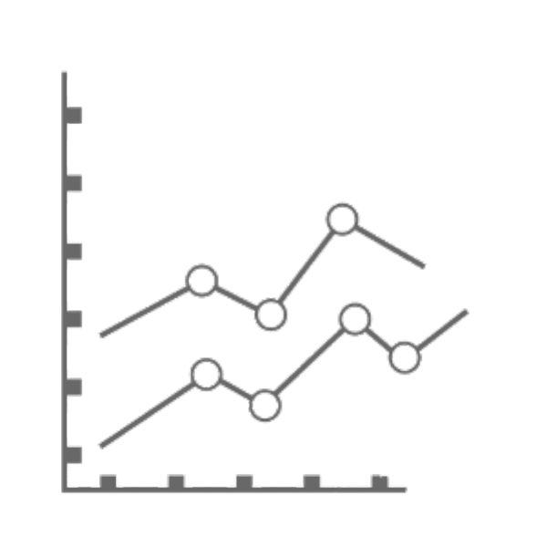
Line Charts

Line charts are best for showing trends over time. Want to see the growth of your website’s traffic over a year? Line charts can present this data cleanly.
Line charts are another popular and simple type of chart that you can use to visualize your data. They consist of a series of points connected by straight lines, forming a line that shows the change in values over time. Line charts are best for showing trends over time. For example, if you want to see the growth of your website’s traffic over a year, line charts can present this data cleanly. You can easily see the ups and downs, the peaks and valleys, and the overall direction of your traffic. A line chart can also show the relationship between two or more variables over time, such as the correlation between temperature and ice cream sales. Line charts are useful and intuitive, making them a great choice for many situations.
Pie Charts
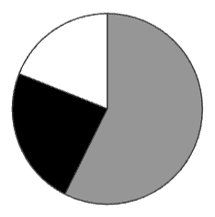
Pie charts are great for displaying a part-to-whole relationship. Need to illustrate a budget? Pie charts give a clear picture.
Pie charts are another common and simple type of chart that you can use to visualize your data. They consist of a circular shape divided into slices, each representing a proportion of the whole. The size of each slice is proportional to the percentage of the total value that it represents. Pie charts are great for displaying a part-to-whole relationship. For example, if you need to illustrate a budget, pie charts give a clear picture of how much money is allocated to each category, and how each category compares to the others. A pie chart can also show the composition of a population, such as the age groups, genders, or ethnicities. Pie charts are colorful and easy to read, making them a great choice for many situations.
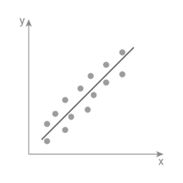
Scatter Plots

Scatter plots are perfect for showing relationships between two variables. Looking to find correlation between age and income? This is the graph for you.
Scatter plots consist of a collection of points on a two-dimensional plane, each representing the values of two variables for a single observation. Scatter plots are perfect for showing relationships between two variables. For example, if you are looking to find correlation between age and income, this is the graph for you. You can easily see how the two variables vary together, and whether there is a positive, negative, or no correlation. A scatter plot can also show outliers, clusters, and gaps in your data. Scatter plots are powerful and insightful, making them a great choice for many situations.
Area Charts
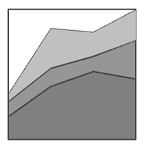
Area charts can illustrate trends and are particularly useful for showing cumulative totals. Interested in how savings accumulate over time? Consider an area chart.
Area charts are similar to line charts, but they have a shaded area below the line that shows the magnitude of the values. Area charts can illustrate trends and are particularly useful for showing cumulative totals. For example, if you are interested in how savings accumulate over time, consider an area chart. You can easily see how much money you have saved at any point in time, and how the savings rate changes over time. An area chart can also show the contribution of different components to a total, such as the sources of revenue or the types of expenses. Area charts are expressive and informative, making them a great choice for many situations
Histograms

Histograms are used for displaying frequency distributions. Studying the distribution of customer satisfaction scores? A histogram will serve you well.
Histograms are similar to bar charts, but they have no gaps between the bars and they show the frequency of values in a continuous variable. Histograms are used for displaying frequency distributions. For example, if you are studying the distribution of customer satisfaction scores, a histogram will serve you well. You can easily see how many customers gave a certain score, and how the scores are spread across the range. A histogram can also show the shape of the distribution, such as whether it is symmetric, skewed, or bimodal. Histograms are descriptive and revealing, making them a great choice for many situations.
Graph Types
Time Series
Time series graphs are vital for tracking changes over periods. Monitoring stock prices? Time series graphs are the way to go.
Time series graphs are similar to line charts, but they show the change in values over a specific period of time, such as days, months, or years. Time series graphs are vital for tracking changes over periods. For example, if you are monitoring stock prices, time series graphs are the way to go. You can easily see how the prices fluctuate over time, and how they respond to external events, such as news, earnings, or market trends. A time series graph can also show the seasonality, cycles, and trends of your data. Time series graphs are dynamic and insightful, making them a great choice for many situations.
Correlation
Correlation graphs help in identifying patterns between two variables. Investigating how temperature affects sales? Use this graph.
Correlation graphs are another type of chart that you can use to visualize your data. They are similar to scatter plots, but they show the strength and direction of the linear relationship between two variables. Correlation graphs help in identifying patterns between two variables. For example, if you are investigating how temperature affects sales, use this graph. You can easily see if there is a positive correlation (higher temperature leads to higher sales), a negative correlation (higher temperature leads to lower sales), or no correlation (temperature has no effect on sales). A correlation graph can also show the correlation coefficient, which is a numerical measure of how closely the variables are related. Correlation graphs are helpful and informative, making them a great choice for many situations.
Distribution
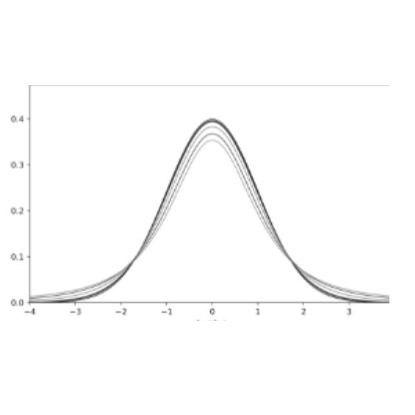
Distribution graphs depict how variables are spread out. Analyzing product quality? This is your choice.
Distribution graphs are similar to histograms, but they show the probability density of a continuous variable, rather than the frequency. Distribution graphs depict how variables are spread out. For example, if you are analyzing product quality, this is your choice. You can easily see the mean, median, mode, standard deviation, and range of your data. You can also see the shape of the distribution, such as whether it is normal, skewed, or uniform. A distribution graph can also show the confidence intervals, which indicate how certain you are about the true value of the mean. Distribution graphs are descriptive and analytical, making them a great choice for many situations.
Comparison
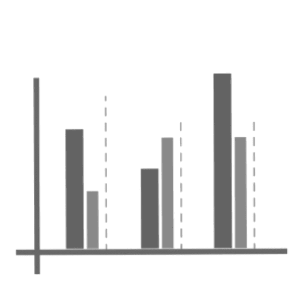
Comparison graphs are used to contrast different data sets. Comparing marketing channels? Select this type.
Comparison graphs are similar to bar charts, but they show two or more data sets side by side, or stacked on top of each other, to highlight the differences and similarities between them. Comparison graphs are used to contrast different data sets. For example, if you are comparing marketing channels, select this type of graph. You can easily see how each channel performs in terms of reach, engagement, conversion, and revenue. You can also see how the channels compare to each other, and to the overall average. A comparison graph can also show the variance, which indicates how much the data varies from the mean. Comparison graphs are useful and informative, making them a great choice for many situations.
Common Mistakes in Data Visualization

Data visualization is a powerful tool that can help you communicate your data in a clear and compelling way. But it can also backfire if you make some common mistakes that can distort, confuse, or mislead your audience. Here are some of the pitfalls that you should avoid when creating charts and graphs:
- Misleading Scales: Scales are the numbers that show the range of values on the axes of your chart. They can easily misrepresent data if not chosen wisely. For example, if you use a scale that is too large or too small, you can make the differences between data points look bigger or smaller than they really are. Or if you use a scale that is not consistent across charts, you can make unfair comparisons between data sets. To avoid misleading scales, you should always choose a scale that is appropriate for your data, and that is consistent and transparent for your audience.
- Too Many Colors: Colors are a great way to add visual interest and contrast to your chart. But too many colors can lead to confusion rather than clarity. For example, if you use too many colors to represent different categories, you can make it hard for your audience to distinguish between them. Or if you use colors that are too similar or too different, you can make it hard for your audience to see the patterns or trends in your data. To avoid too many colors, you should always use a color scheme that is suitable for your data, and that is simple and intuitive for your audience.
- Overcomplicating: Simplicity often wins. Ever felt overwhelmed by a complex chart? You’re not alone. Sometimes, we try to cram too much information or detail into our chart, thinking that more is better. But this can make our chart look cluttered and confusing, and distract our audience from the main message. To avoid overcomplicating, you should always focus on the key point that you want to convey with your chart and eliminate any unnecessary or redundant elements that might obscure it.
Conclusion
You have reached the end of this comprehensive guide on choosing the right chart or graph for your data. We hope that you have learned a lot from this guide and that you are now ready to create your own stunning and effective visualizations.
Choosing the right chart or graph for your data is crucial for accurate and effective data presentation. By understanding the differences and uses of various charts and avoiding common mistakes, you can create compelling and insightful visualizations that will capture the attention and interest of your audience. You can also communicate your data in a clear and concise way, and reveal the hidden stories and insights that lie within your data.
We hope that this guide has been helpful and informative for you and that you have enjoyed reading it as much as we have enjoyed writing it. Data visualization is a fascinating and rewarding field, and we encourage you to explore it further and apply it to your own projects. Remember, a picture is worth a thousand words, but a good chart or graph is worth even more. Happy visualizing!