Unveiling the Power of Data Visualization: From Cognitive Foundations to Future Frontiers
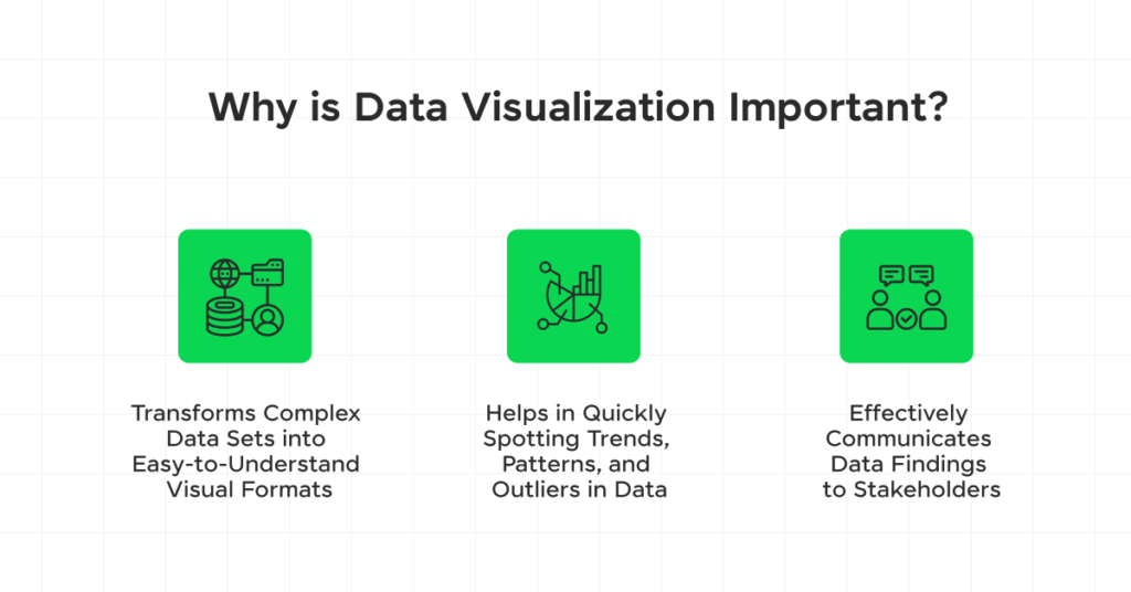
We all learn in different ways. Some people prefer to read information, others like to listen to it, yet the majority of us would agree that to visualize data properly and accurately, a visual representation of it is always better. For sure, statistics and numbers have their place, but when you can easily see data in the form of a chart or a graph, it sticks in your mind much easier. For that reason, data visualization tools have become extremely popular over the last few years.
To add further weight to the argument, studies have shown that companies using data visualization are far more likely to discover information relevant to their needs. It’s understandable why this is the case; after all, it’s never easy to stare at endless sheets of data and try to extract the most useful pieces. Visualizing this data makes it pop. It stands out and allows you to find the most useful pieces without spending hours trawling through statistics and numbers.

Table of Contents
TL;DR
How Storytelling with Charts is Changing the Game
The Cognitive Foundations of Data Visualization
The Ethics of Data Visualization
Emerging Technologies in Data Visualization
The Future of Data Visualization and Big Data
Data Visualization Types and Their Applications
Data Visualization in Various Industries
Data Visualization Step By Step
Learnings Recap
TL;DR
- Data visualization presents complex information in an engaging, digestible way.
- Storytelling With Charts offers a free PowerPoint plugin which comes with a large range of customizable charts.
- When presenting data, it’s vital to ensure it is ethical and transparent at every turn.
- The future of data visualization is constantly changing with new technologies.
- Identifying the best charts for your industry is an essential step.
- Scroll down to see our full step by step tutorial with graphics.
How Storytelling With Charts is Changing the Game
Data visualization isn’t only about being able to spot important data easily during research and reporting, it’s also about presenting that information in a way that your audience understands and finds engaging. Think back to the last time you sat through a PowerPoint presentation that had endless numbers and spreadsheets within it. Were you bored? Possibly. Did you understand the point of the presentation? Maybe generally but perhaps you lacked context regarding the bigger picture. That’s where Storytelling With Charts comes in. PowerPoint Presentations don’t have to be boring; they can be attractive, informative, interactive, and above all else, serve their real purpose: delivering important information.
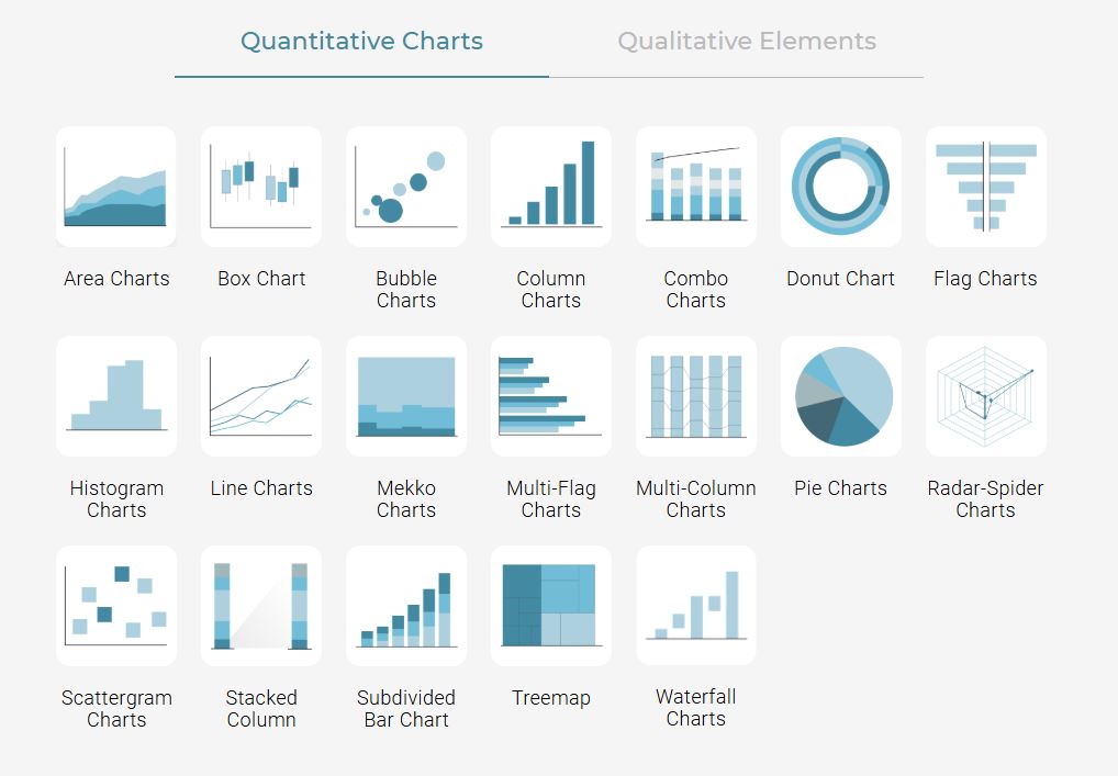
Let’s break it down. Storytelling With Charts is a free PowerPoint plugin that offers beautiful data visualization in the easiest possible way. It’s an ideal option for professionals, students, and teachers who want to display information easily. It’s also true that every presentation is different, requiring specific charts for a range of data types. This plugin covers that option with a huge number of both quantitative and qualitative charts in a drag-and-drop format. Basically, not only does it make your presentations pop, but it’s also extremely easy to set up and use. Not only that, but charts can easily be customized to suit branding or any specific needs. And yes, it’s free. You might wonder how, but there really are no hidden charges or subscriptions here, just a professional tool that delivers the information you need in a way that cuts out all the yawns.
The Cognitive Foundations of Data Visualization
To understand why data visualization is important, it’s useful to learn more about its cognitive foundations; that is, how our brains actually process information presented visually. This becomes even more critical because it’s thought that 90% of the information received by the human brain is visual, and that even images only seen for just 13 milliseconds can be identified. It gives a real insight into the power of the human brain. Tapping into this gives you the upper hand when creating engaging presentations and reports for your audience.
Gestalt Principles in Data Visualization
When creating the best images, it’s a good idea to bear the Gestalt Principles in mind. These dig deep into how the brain groups and organizes visual information, and by applying them, you can create charts that are not only easy to grasp but also memorable. The six principles are:
- The Law of Similarity
- The Law of Pragnanz
- The Law of Proximity
- The Law of Continuity
- The Law of Closure
- The Law of Common Region
Overall, the Gestalt Principles state that the whole is greater than the parts, and that can apply to anything we see around us. So, when we see data presented in charts and graphs, we look at the sum whole, rather than looking too closely at the smaller pieces. Understanding this can help you create data visualization examples that really stand out to your audience. The great thing about using Storytelling With Charts for your data visualization needs is the large range of charts you can choose from, including customizing them to create the ideal option for your brand. In fact, our resource on tips for engaging chart and graphic design will come in very useful here.
Proximity and Similarity in Chart Design
Within the Gestalt Principles, it’s important to consider proximity and similarity in particular. These have a strong impact on chart design, and refers to how close two elements sit to one another. On the other hand, similarity is about how alike different parts appear to the eye. You can use both of these points to group different types of data together and enhance how your audience comprehends them. Of course, this is particularly useful if your data is quite complex.
Closure and Continuity for Data Storytelling
The human brain has a knack for trying to fill in gaps and make sense of whatever it sees, and this is something you can also use when creating charts that engage your audience. This is referred to as closure, yet continuity is also useful. This refers to the brain’s perception of patterns that appear in a continuous manner. By utilizing these aspects, you can create a data visualization chart that is memorable because your audience will work to fill in the blanks, therefore seeing a much wider picture than otherwise.
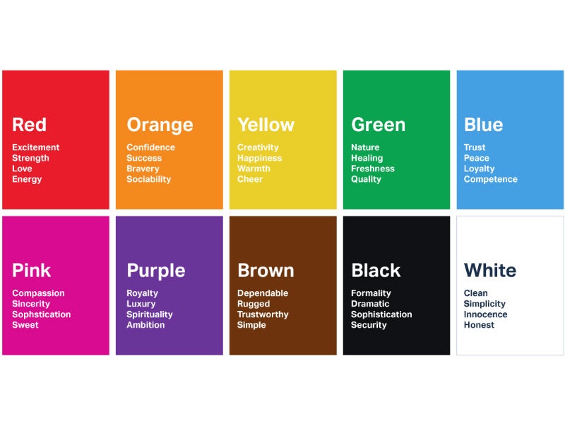
Color Psychology in Data Representation
It probably comes as no surprise to learn that color is also important when creating charts within a presentation. A black and white presentation isn’t going to capture the attention as much as a colorful one that is not only eye-catching but organized well. However, remember that this isn’t just about making something look attractive; it’s also about using color in a strategic way, pulling your audience’s attention toward the key points, while also boosting their overall understanding. Color is also useful in connecting with certain emotions. So, if you want to create a specific feeling amongst your audience, color psychology is the way to go with a presentation that stands out.
However, always remember that there are cultural and societal aspects to consider here too. For instance, always make sure that your visualizations are accessible to everyone, including colorblind individuals. To overcome this, look for color schemes that could easily be distinguished by someone who is colorblind, such as blue and yellow, rather than red and green.
The Ethics of Data Visualization
Using data visualization software is about more than creating a quality presentation or report. It’s vital to remember the responsibility that comes along with it. Think about it: you’re influencing your audience’s opinions and thoughts through the data you’re presenting to them, and using specific strategies to cement it in their mind. That means there are some ethical things to bear in mind, including avoiding manipulation, bias, and ensuring transparency.
Before we jump in, check out our article on the best practices for data-driven storytelling.
Data Integrity & Visual Honesty
It’s essential that your data is not only accurate but also presented in a way that leaves no room for misinterpretation. How can you do this?
The first option is to ensure that you avoid any deceptive scaling techniques, because this can seriously affect how data is perceived by your audience. It’s also critical to be transparent at every turn. Remember, transparency builds trust with your audience and it ensures that they see you as a credible source.
Ethical Storytelling with Data
We’ve talked about the fact that data visualization is a very powerful tool and when you use that to tell a story to your audience, the ethical responsibilities must be kept in mind. The data you present must be objectively presented and there should be zero influence over what you show and how you expect your audience to take it on board. After all, as long as you’re honest with your data, your audience will absorb it as they’re meant to anyway.
Framing and Context in Data Presentation
How you frame data goes a long way toward impacting on how it is interpreted by those around you. For instance, data bias simply misinterprets the facts you’re trying to communicate. You can overcome that by using diverse data sources and peer reviews within your presentation. Similarly, visual deception is a danger and can lead to misleading assumptions and conclusions. Using consistent scaling and clear labeling is the way to avoid this. Next, we can talk about a lack of transparency which leads to reduced trust in you and your company as a source of information. How can you avoid it? By sourcing your citations clearly and disclosing your methodology. Finally, to avoid narrative manipulation, which can skew interpretation, ensure you use several perspectives and always use neutral language.
Emerging Technologies in Data Visualization
Making use of the best data visualization tools means always being on the lookout for new technology that may be lurking on the horizon. It should come as no surprise that data visualization techniques are constantly evolving, and everyone is looking for ways to boost PowerPoint presentations. Of course, this is only beneficial because it means you can utilize new features to take your presentations to the next level. Let’s take a deeper look at some of the most cutting-edge technologies that are currently overhauling the data visualization field.
AI and Machine Learning in Visualization Creation
We can’t talk about technological advancements and not mention AI, something that seems to be at the center of everything these days. Both AI and machine learning are changing data visualization for the better, helping us to not only generate quality charts and presentations, but also optimize and personalize at the same time.
For instance, AI has the power to identify key insights within large amounts of complex data and highlight it more clearly. This saves time as it means you don’t need to manually scroll through endless spreadsheets looking for the main points. Additionally, AI and machine learning can help you maintain visual consistency across your visualizations, creating a more professional and credible outcome.
While you’re here, explore our article on PowerPoint add-ins for better productivity and time-saving.
Immersive Data Visualization
In addition to AI, we can also talk about virtual and augmented reality, especially in terms of spatial data. These types of technologies work very well in showcasing complex data in a three dimensional way. Haptic feedback is something else to mention, which adds a new sensory route for audiences looking to comprehend data in a deeper way.
The Future of Data Visualization and Big Data
Over the last few years, we’ve seen a huge focus on big data visualization and that has certainly created a huge range of new opportunities to showcase data in a clearer and less complex way, while not missing out on its nuances. Let’s take a closer look at what the future might look like, especially in helping us visualize huge amounts of data within charts and presentations overall.
While you’re here, learn more about the intersection of big data and visualization in our blog on data storytelling for beginners.
Real-time Data Visualization Strategies
Storytelling With Charts offers a huge range of different templates to help you make visualizations for slides, and you can also create your own, however understanding how to utilize real-time data is equally as important. After all, we live in a world where data comes at us from all directions. So, how can you create the most dynamic data visualizations that not only show your audience what you need them to absorb but also update in real-time for clearer insights?
Streaming Data Visualization
Attempting to visualize data that arrives in a consistent stream is challenging to say the least. However, edge computing is a data visualization method that comes in very useful indeed. Edge computing allows for real-time data to be visualised at the point of collection, where it is generated, rather than relying on internal servers to sort it first. That means the data is as up-to-date as possible providing it is retrieved at the last minute. This method makes use of local edge servers and IoT devices, but also comes with unique challenges, such as problems of using a device with low bandwidth.
Multisensory Data Representation
The phrase ‘data visualization’ makes you think that it’s all about what you see, but technology is taking things a step further. Nowadays, there are innovations that allow users to touch, listen to, and even smell data experiences in the most immersive way possible.
To explain how this works in practice, imagine a trading platform, perhaps in finance, that uses sound to show market volatility. It could also use haptic feedback to show when trades are taking place, or even visual cues for movements in price. This creates an overall multisensory experience for the audience, pulling their attention much closer and allowing for true immersion.
In fact, sound in particular is very powerful. Many people prefer to learn by listening rather than seeing. As mentioned earlier, we all learn in different ways, whether through reading or doing. Yet, audible methods are one of the most commonly used. Data sonification can be very useful for time-series or cyclical data in particular.
And you might wonder how smells come into it, but olfactory data is certainly on the rise. If you’ve ever been taken back in time upon smelling a particular scent, you’ll understand the power of the olfactory system. Using this for good data visualization can create an entirely new experience and one that is truly immersive.
Data Visualization Types and Their Applications
We’ve mentioned that you can use a large range of different charts in the Storytelling With Charts plugin, but it’s important to learn more about them so you can choose the best one for your needs. It’s true that there are a huge number of different data visualization examples out there, and they all have their pros and cons for specific uses. Understanding which ones are best for your needs will help you create the best reports and presentations possible.
While you’re here, read our guide on choosing the right chart in our storytelling chart guide.
Advanced Chart Types
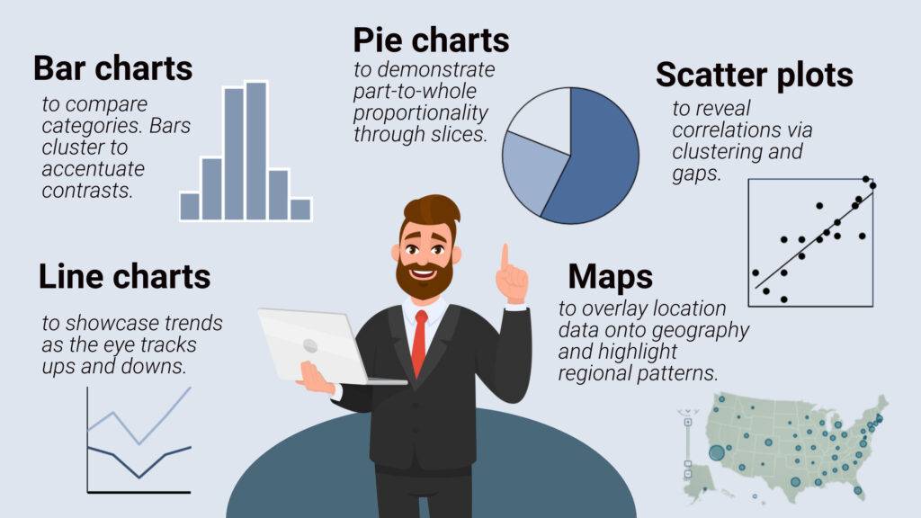
The most basic visualization types include line and bar charts, but this extends to more sophisticated types that can display large amounts of data in a clear and engaging way. These are certainly less commonly used but they should be at the forefront of your mind in case these are the best option for your presentation needs. It’s also true that these advanced types can help your audience dig deeper into unique insights, especially with complex data.
Sankey Diagrams for Flow Visualization
Sankey diagrams are useful for data analysis and visualization, particularly looking to showcase how resources or information flows between different processes. If you have data such as this, a Sankey diagram could be the best choice to help your audience interpret the flow from one state to the next.
Chord Diagrams for Relationship Mapping
If you have complex connections between datasets, a chord diagram is a good option to choose. It is particularly helpful in comparing similarities within the same data group, or separate groups of data.
Interactive and Animated Visualizations
While static data visualizations work in most situations, there are still the options to animate your visualizations and really bring them to life. However, it’s just as important not to over-do animations and interactive options as they can be overwhelming. In the right situation, they’re extremely engaging, and they also help your audience to take on board data at their own pace, focusing on the areas they find most interesting.
Within this, brushing and linking techniques can be used in multi-view visualizations. Here, users can choose different sets of data and see how they relate with each other across several different charts. This is a powerful way for users to interact with data and absorb it more deeply.
Finally animated transitions are useful in data stories as they can help your audience understand the specific changes across a set of data while maintaining context, especially if the data is particularly complex.
Data Visualization in Various Industries
Data visualization is a very personal deal, and specific industries have their own needs in terms of how they present and showcase data to their audiences. To help you choose the best option for your needs, let’s explore how different sectors apply data visualization to solve challenges and create actionable insights.
The finance sector is a good place to start. The most common visualization types used here are tree diagrams and candlestick charts. These do have their own challenges, such as problems with risk assessment and real-time data, but they also offer clear risk indicators and interactive drill-downs. Healthcare sectors often use epidemiological maps and patient flow diagrams, which can be problematic in terms of complex relationships between data and patient privacy. However, they allow for intuitive color coding and have HIPAA compliance.
Now, let’s talk about manufacturing. The key visualization types here include process flow charts and quality control charts, which have challenges in terms of multivariable processes and time-sensitive data. Yet, they allow for real-time monitoring and anomaly highlights. As you can see, no charge is without its challenges, but it’s a case of weighing up the pros and cons and finding the best. When it comes to marketing, the key types include customer journey maps and funnel charts. The challenges here include attribution modeling and multi-channel data, but they allow for cross-channel visualization and cohort analysis in particular.
Finally, let’s highlight environmental science. This sector often makes use of time-series graphs and geospatial maps, but they are challenging in terms of identifying long-term trends and large-scale datasets. However, they’re useful for predictive visualizations and multi-layer mapping.
Data Visualization Step By Step
Rows of sterile spreadsheets hardly get hearts racing. But visualized as stunning interactive charts and dashboards, that same data leaps to life! This hands-on tutorial explores how anyone can easily transform boring data into captivating visual stories using the right tools and techniques.
We’ll walk through key steps to take raw data and make it pop. Follow along to create your own sleek, informative data visualizations using leading platforms like Tableau, Power BI, and more.
Step 1: Choose the Right Chart Types
Like a master chef picks ideal knives, select charts suited to your data stories:
Match chart types strategically to the insights you want to highlight.
Step 2: Simplify Ruthlessly
Resist overstuffing visuals with excessive text, tick marks, logos, and clutter. Enable clarity through simplicity:

As Antoine de Saint-Exupéry said, “Perfection is achieved not when there is nothing more to add, but when there is nothing left to take away.”
Step 3: Make Key Points Pop
Guide viewers to essential insights by using:
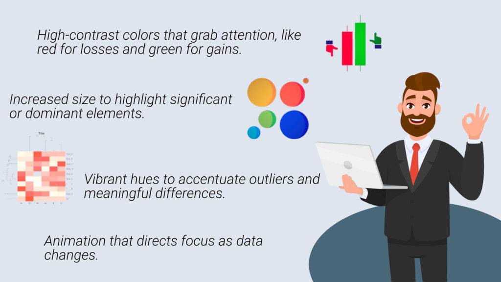
Spotlight your main story while eliminating distractions.
Step 4: Maintain Data Integrity
Never mislead. Build trust through best practices:
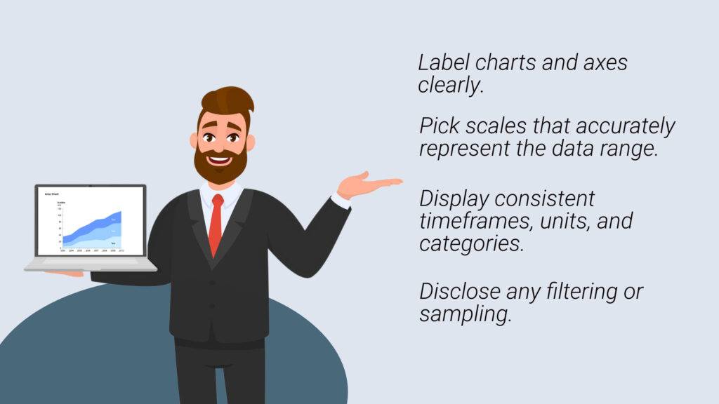
Even well-intentioned shortcuts can misinform without scrutiny. Uphold integrity.
Step 5: Direct with Layout
Use layout to eliminate meandering and hesitation:
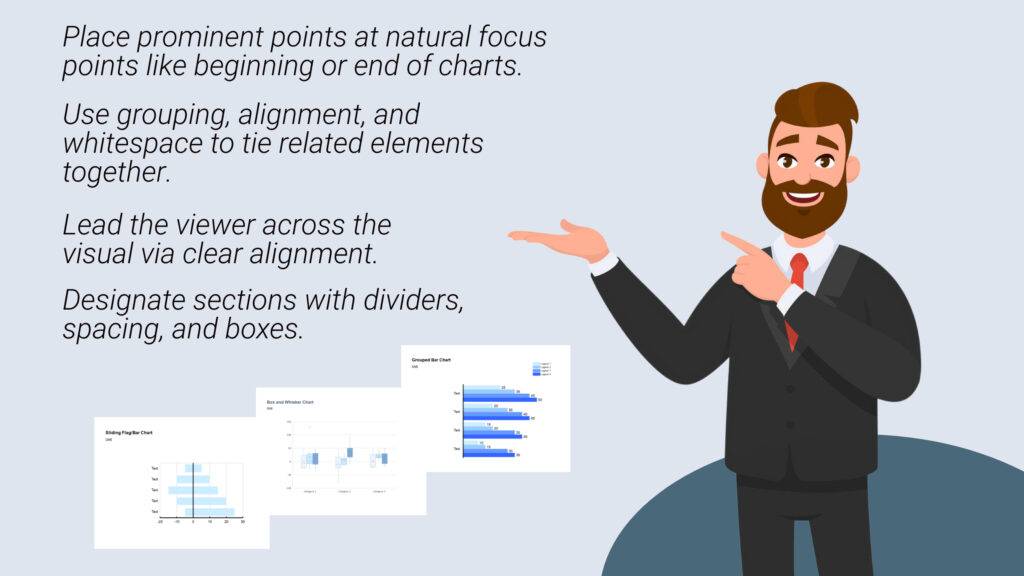
Let strategic layout steer the story.
Step 6: Create Visualizations with Top Tools
Now let’s look at intuitive software options to bring data to life:

The right platforms remove technological hurdles so anyone can visualize data effectively.
You now have the key steps to transform stale data into insightful visual stories. But remember that compelling narratives also require creativity, strategy, and perspective. Move beyond reporting to craft captivating stories that surprise and engage on an emotional level. Let your data find its inner storyteller!
Learnings Recap
- Data visualization has its roots in cognitive science, making use of complex theories like the Gestalt Principles and color psychology. Utilizing these can boost your understanding and help create better visualizations.
- It’s important to think about ethical considerations in data and visualization, including ensuring the integrity of data, transparency, and avoiding practices that aim to deceive.
- There are many emerging technologies to keep an eye on, such as AI, VR, and AR, which create a range of new opportunities for the future of data visualization.
- Looking to the future, big data challenges, real-time analytics, and immersive data experiences are likely to be challenges.
- Every industry has specific data visualization needs, and it’s important to assess your industry and find the best chart types.
- Moving on from basic data charts, advanced options create immersive and innovative opportunities to showcase complex data and tell data stories.
Final Thoughts
Now that you understand what data visualization is and the finer nuances of the subject, you have all the information you need to move forward and enhance your own data stories. Remember to take the time to think carefully about which chart types would suit your needs best, and how you want to present information to your audience. There are many resources available to help you on our blog, including our guide to crafting an impactful executive summary slide, to name just one. Storytelling with Charts is on hand to help you every step of the way and offers tools to not only present your data in the clearest and most engaging way, but to make it impactful and memorable at the same time. Remember, our AI-powered plugin is free to download and use, with no hidden fees or subscription charges at any time. You’re free to explore and choose from our large range of chart types and easily integrate them into your PowerPoint presentations.
So, are you ready to take your raw data and turn it into a compelling story? Visit Storytelling With Charts to get started!
More From Storytelling With Charts
How to Add Graphs to Your PowerPoint Presentations Easily
How to Create a PPT Table with Bar Chart for Stunning Data Visualization
How Can I Make PPT Presentation That Stands Out
How to Create and Insert Pie Charts in PowerPoint for Stunning Presentations