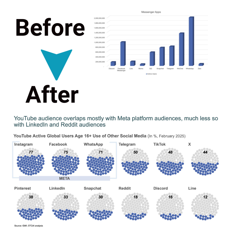
Discover the Secrets of Compelling Data Narratives with ‘Storytelling with Data
Have you ever found yourself drowning in a sea of data, unsure where to start? Ah, join the club. Here’s an insider tip I’ve picked up along the way – transforming that raw information into a compelling tale can truly turn it into a powerful aid for understanding and communication.
In this article, we’ll unlock the little-known secrets of ‘storytelling with data,’ demonstrating how you can breathe life into your data sets by constructing engaging narratives from them.
So are you ready to unravel the endless possibilities hidden within your information? Let’s embark on this journey together!
Key Takeaways
- Data storytelling is a powerful way to transform boring numbers into engaging narratives that help us understand and make smart choices.
- Different types of data visualizations, such as bar charts, line charts, and scatter plots, can be used to tell stories and present data in a more meaningful way.
- Best practices for data storytelling include creating visual hierarchies, building trust in data visuals, keeping visualizations simple, using colors wisely, and highlighting important data.
- Leveraging data storytelling in businesses improves analysis, problem – solving capabilities, engages audiences, enhances reporting abilities,
Importance of Data Storytelling
Data storytelling has a key role today. It turns hard facts into tales we can follow. For example, let’s say you have tons of data about your sales last year. Without data storytelling, you’re just looking at boring numbers.
But with it, those numbers turn into a story about what sold well and why.
This is handy in many cases. In business, it helps bosses make smart choices. Take the sales info from before as an example again: knowing what sold well can tell a company where to put its money next year! This is only one way data storytelling helps us understand things better.
Types of Data Visualizations for Storytelling
There are different types of data visualizations that can be used for storytelling. One common type is a bar chart, which uses vertical or horizontal bars to compare different categories or values.
Line charts, on the other hand, are useful for showing trends over time. Pie charts can be used to show proportions or percentages within a whole.
Another type of visualization is a scatter plot, which displays the relationship between two variables through points on a graph. Heat maps use colors to represent data density or intensity across different categories or regions.
And don’t forget about maps themselves, which can help tell location-based stories and show patterns across geographies.
Each type of visualization has its own strengths and weaknesses, so it’s important to choose the right one based on the story you want to tell and the data you have available. By selecting an appropriate visualization technique, you can make your data more engaging and easier for audiences to understand.
Best Practices for Data Storytelling
Create visual hierarchies, build trust into data visuals, keep visualizations simple, use colors wisely, and highlight important data to create compelling data narratives. Discover these best practices for effective data storytelling that will captivate your audience and make your data come alive.
Read more to unlock the secrets of powerful storytelling with data.
Create visual hierarchies
To create effective data visualizations, it’s important to create visual hierarchies. This means organizing your data in a way that guides the viewer’s attention and helps them understand the most important information first.
You can achieve this by using larger or bolder elements for key data points, such as titles or headings. Additionally, you can use color contrast to highlight important data and make it stand out from less significant information.
By creating clear visual hierarchies, you can ensure that your audience easily grasps the main message of your data story without getting overwhelmed by too much information at once.
Build trust into data visuals
To build trust in data visuals, it is essential to ensure accuracy and transparency. When presenting data, it is important to use credible sources and reliable methods of data collection.
By providing clear labels and explaining the methodology behind the visualizations, we can help viewers understand the data’s integrity. Additionally, using consistent scales and avoiding misleading techniques like distorted axes or inappropriate chart types helps maintain trust.
By prioritizing accuracy and transparency in our data visuals, we can establish credibility with our audience and effectively communicate insights.
Keep visualizations simple
Visualizations are an important tool in data storytelling. To effectively communicate your message, it’s crucial to keep your visualizations simple. This means avoiding unnecessary clutter and complexity that can confuse or overwhelm your audience.
Instead, focus on presenting the key information clearly and concisely. Use clean designs, clear labels, and easily understandable graphics to help viewers grasp the main points of your data story quickly and effortlessly.
By keeping visualizations simple, you increase the chances of engaging with your audience and conveying your message effectively.
Use colors wisely
Colors play a crucial role in data storytelling. By using colors wisely, we can enhance the impact and understanding of our visualizations. When choosing colors for data visualizations, it is important to keep in mind the purpose of the visualization and the message we want to convey.
Additionally, using a limited color palette can help ensure that our visuals are clear and easy to interpret.
One key consideration when using colors is to create contrast between different elements of the visualization. This helps in highlighting important data points or patterns. For example, we can use a bold color for the main focus and a more subdued color for supporting information.
Another important aspect is to avoid using misleading or distracting colors. It’s essential to choose colors that accurately represent the data without distorting its meaning. Remember, simple and clean visuals with appropriate color choices can make it easier for our audience to understand and engage with the data story.
Highlight important data
In data storytelling, it is crucial to highlight the important data that supports your narrative. This helps your audience pay attention to the key insights and understand the message you’re trying to convey.
By using visual cues such as bold colors or larger font sizes, you can draw attention to specific data points or trends. It’s also important to use clear labels and titles that explicitly state the main takeaway from the data.
This way, your audience can quickly grasp the significance of the information you’re presenting without getting overwhelmed by unnecessary details. Overall, highlighting important data ensures that your story is impactful and easily understood by your audience.
Leveraging Data Storytelling in Businesses
Leveraging data storytelling in businesses can lead to improved analysis, problem-solving capabilities, engaging audiences, better reporting abilities, and a wider reach. Discover how data narratives can transform your business in compelling ways.
Improved analysis
Data storytelling improves analysis by transforming raw data into a narrative that is easier to understand and interpret. By presenting data in a visual and engaging way, it allows analysts to uncover insights more effectively and make better-informed decisions.
Data narratives enable analysts to spot patterns, trends, and outliers that may not be apparent when examining individual data points. It helps them connect the dots and draw meaningful conclusions from the information at hand.
With improved analysis through data storytelling, businesses can gain valuable insights that drive positive change and growth.
Problem-solving capabilities
In data storytelling, problem-solving capabilities are a key benefit for businesses. By analyzing and presenting data in a compelling way, organizations can gain valuable insights into challenges and find effective solutions.
Data narratives help identify patterns, trends, and correlations that may not be immediately apparent. This enables decision-makers to make informed choices based on evidence rather than assumptions or guesswork.
With the power of data storytelling, businesses can tackle complex problems head-on and drive positive change within their operations.
Engaging audiences
Engaging audiences is a crucial aspect of data storytelling. By presenting data in a compelling and accessible way, we can capture the attention and interest of our audience. Visualizations play an important role in engaging audiences, as they help to simplify complex information and make it easier to understand.
Using clear and concise language, along with powerful visuals, can help to bring data to life and make it more relatable for our audience. Engaging audiences also involves considering their needs and interests, tailoring our message accordingly, and using storytelling techniques to create emotional connections.
Ultimately, by engaging our audience through effective data storytelling, we can better communicate insights and inspire action based on the information we present.
Better reporting abilities
I can improve my reporting abilities by using data storytelling techniques. By transforming raw data into a compelling narrative, I can present information in a more engaging and impactful way.
This allows me to communicate insights effectively and make my reports more understandable for the intended audience. With better reporting abilities, I can provide clearer and more meaningful information that helps inform decision-making within the business.
Data storytelling enables me to capture attention, emphasize important points, and create a stronger connection between the data and its interpretation. It’s an essential skill that enhances my ability to convey complex information in a way that is both informative and accessible.
Wider reach
Leveraging data storytelling allows businesses to reach a wider audience with their insights and findings. By presenting data in a narrative format, it becomes easier for people across different backgrounds and levels of expertise to understand complex information.
This means that companies can effectively communicate their message not only to data analysts but also to executives, stakeholders, and even customers. Data storytelling has the power to engage diverse audiences and make data-driven insights more accessible and relatable.
With a wider reach, businesses can ensure that their findings are understood by a broader range of individuals, ultimately leading to better decision-making and improved outcomes.
Resources and Tools for Data Storytelling
Discover a wealth of resources and tools to enhance your data storytelling skills, including books, workshops, online communities, and customer testimonials. Dive into the world of data visualization and presentation with confidence!
Books
In my journey to master the art of data storytelling, I have found books to be an invaluable resource. One book that stands out is “Storytelling With Data” by Cole Nussbaumer Knaflic.
This popular book provides a comprehensive guide on how to effectively communicate with data and create compelling narratives. It explores the principles of visual storytelling and offers practical tips for avoiding common mistakes in data storytelling.
By reading this book, I have gained a deeper understanding of the fundamentals of data visualization and learned how to use data to tell a story that engages and influences others.
Workshops and Presentations
I have found that attending workshops and presentations can be incredibly valuable when it comes to mastering the art of data storytelling. These events provide an opportunity to learn from experts in the field and gain practical insights into effective techniques for communicating with data.
Workshops offer hands-on activities and exercises that allow participants to practice creating compelling narratives using real-world datasets. Presentations, on the other hand, showcase successful examples of data storytelling and provide inspiration for your own projects.
Additionally, these events often foster a sense of community where you can network with like-minded individuals and exchange ideas. Overall, workshops and presentations serve as powerful learning resources that can enhance your skills in data storytelling and help you become a more effective communicator with data.
Online community
I love being part of an online community for data storytelling. It’s a great way to connect with like-minded individuals who are passionate about using data to tell compelling stories.
In these communities, you can find resources, ask questions, and share your own experiences in data storytelling. It’s a supportive environment where people come together to learn and grow in their skills.
I’ve found valuable workshops and presentations that have helped me improve my data storytelling techniques. Plus, it’s inspiring to see examples of how others have effectively used data visualization to communicate their messages.
Customer testimonials
I’ve been fortunate to receive many positive testimonials from customers who have experienced the power of data storytelling. One customer shared that after implementing data storytelling techniques, they were able to communicate insights more effectively and make better-informed decisions.
Another customer mentioned how data storytelling helped them engage their audience and improve reporting abilities. These testimonials highlight the value of using data narratives in businesses and demonstrate the real-world impact it can have on analysis, problem-solving, and communication.
Hearing these success stories reinforces my belief in the importance of mastering the art of data storytelling.
Additional resources for visualizing and presenting data.
There are various additional resources available for visualizing and presenting data effectively. These resources can help you enhance your skills and create compelling visualizations.
You can explore books on data visualization, attend workshops and presentations, or join online communities where you can learn from experts and share your work with peers. Customer testimonials and case studies can provide inspiration and insights into successful data storytelling.
Additionally, there are numerous tools available that offer features for creating impactful charts, infographics, and interactive visualizations. These resources can be valuable in improving your abilities to present data in a clear and engaging manner.
Conclusion
In conclusion, data storytelling is a powerful tool for effectively communicating insights and engaging audiences. By following best practices and incorporating visual storytelling techniques, businesses can leverage the power of data to improve analysis, problem-solving capabilities, reporting abilities, and reach wider audiences.
With the right resources and tools, anyone can master the art of compelling data narratives and unlock their potential to drive change. So let’s embrace the secrets of ‘Storytelling with Data’ and harness the transformative power of storytelling in our data-driven world.
FAQs
1. What is the meaning of ‘Storytelling with Data’?
‘Storytelling with Data’ means using data to tell a story. It’s about joining data analysis, interpretation, and communication in one structure.
2. How can I learn about ‘Storytelling with Data’?
You can get better at this art through data storytelling training sessions. These sessions use examples to teach you.
3. What are common mistakes in data storytelling?
Common mistakes include bad data analysis and poor presentation of the results. Also, not knowing how to use the right methods for effective communication could lead to problems.
4. Can ‘Data-driven Storytelling’ help me in my job?
Yes! This skill makes it easier to present your findings based on facts from your data analytics work.


