Steps for Crafting an Impactful Data Narrative With Charts
Data storytelling, which indicates a necessary shift in how people interpret the vast amount of data available, has become a go-to visual communication solution in this data-driven world. The data crew is no longer the only one who can analyze data. An organization often performs better when it has more personnel who can interpret data narrative.
According to a recent survey conducted by the Harvard Business Review, 87% of participants said that their companies would operate more effectively if their front-line employees had greater access to data.
Finding insights, though, is only the beginning of bringing about change. The true value is the ability to use insights to craft a story that inspires action and has a noticeable effect. If you’re ready to take a chance and explore the exciting new world of data narrative and storytelling, let’s start with some fundamentals about using charts to tell stories.
Step 1: Do not pick a chart right away
Most individuals find that making charts and graphs is a rather simple process. Your chart is complete once you choose the rows and columns you like to see. Then, click an Excel graph or the Excel chart option, and that’s it.
However, one must work harder to use data to tell tales instead of just displaying information. The Harvard Business Review book Good Charts advises posing these two questions. Ask them to yourself instead of giving in to the temptation to select a chart right away:
- Is the information conceptual or based on data?
- What is the goal—to study something or make a definitive claim?
Step 2: Consider your target audience

The next step is finding out who the story will be told to and their histories. This is crucial in figuring out the technical intricacy of the analysis and the aspects of the narrative that the audience will find interesting to learn about.
A data science team is more concerned with the statistical elements. Meanwhile, an executive team is probably more interested in comprehending the wider business-related consequences.
Step 3: Define the graphic focus and the data narrative you intend to explain
Focusing on your primary message is the secret to successful communication, whether through writing, graphic design, or data visualization.
Experts address the necessity of condensing your message to a “so what” statement in data storytelling. It’s easier said than done, so spend no more than three minutes explaining your tale to a friend or coworker unfamiliar with the facts. Next, simplify this further by reducing it to just one sentence. This statement needs to contain three elements:
- Needs to express your distinct viewpoint.
- Must explain the issues and why your audience should be interested.
- Has to be one whole sentence.
Step 4: Storyboard your narrative using paper, pencils, and physical markers
Grab some colored markers and paper, and start sketching your ideas before you give in to the temptation to open PowerPoint or another desktop tool. To start, Just match some keywords using chart maker tools.
For instance, you most likely require a comparison chart if you have stated that you need to “compare” or “contrast” data. Or a composition chart is required to show “parts of a whole.” To ensure you’re utilizing the best possible visual format, it’s a good idea to test two strategies and determine which best communicates your key point for your data narrative.
Every sketch should spark new ideas, and you may begin prototyping as soon as you find yourself iterating over the same concept while considering colors and precise quantities This process will help you build a compelling data narrative.

Step 5: Use decluttering to refine your chart
You are currently in the data narrative process’s last but most important phases. This is where you can use your understanding of preattentive features to create a visual hierarchy, which is the arrangement of items on a page to influence the reader’s perception of the elements in a particular order.
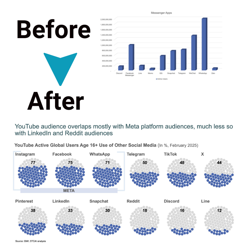
We frequently see the following in text: Our attention is quickly drawn to large, red headlines, as well as strong, italic text. In the context of charts and graphs, size—that is, the amount of space taken up by each element—as well as color are useful tools for highlighting certain information. Make sure your data storytelling has a clear visual hierarchy and is well-structured by adding the following elements:
- Title
- Subtitle
- Visual field
- Axes
- Labels
- Captions
Putting a light gray color to all elements will assist them in blending into the background and draw the audience’s attention in that direction. Next, go through each element in order of significance and purposefully draw attention to the most significant ones by changing the color, thickening the lines, enlarging the images, or labeling and data-marking particularly significant spots.
Step 6: Select the Appropriate Chart Type

Choosing the right chart is crucial to visualize your stories effectively. Consider chart choices like bar graphs to compare categories, line charts for trends over time, and pie charts to depict part-to-whole relationships. Select ones apt for your goal – is it revealing rankings, correlating factors, or simplifying complexity? Using suitable charts channels understanding, while mismatched visuals are perplexing.
Step 7: Incorporate Effective Color Schemes and Fonts
Thoughtful aesthetics enhance professionalism, clarity and engagement. Subtle yet impactful color schemes direct focus and emotions, while label/data fonts should enable fast information absorption. For example, bright contrast colors can spotlight priority data. Clean sans-serif fonts improve text digestion. But steer clear of distractingly flashy palettes or overly decorative script fonts interfering with communication.
Step 8: Add Context with Annotations and Labels
Annotations supplement charts by highlighting key data stories and adding contextual nuance. Labels neatly present facts. Blend these to guide your audience in deciphering meanings, relationships, and conclusions from the visualization without confusion.
Annotations can also improve accessibility for those with visual disabilities. When crafting annotations, aim for brevity but include enough commentary to aid interpretation, draw attention to notable data points, and help viewers grasp the wider implications behind the numbers.
Step 9: Test Your Charts for Understandability and Impact
Gauge if target users grasp your key data narrative stories and find the charts impactful before finalizing. Eliminate aspects producing confusion and consider tweaking visuals needing more memorability. Continuously refine so graphics and narratives unify into intuitive, insightful, and inspiring data narrative experiences.
Before publishing charts widely, have a diverse test group review them to spot interpretation issues or engagement gaps early. Welcome constructive input on confusing data aspects that need clarification or emotionally resonant elements worth emphasizing more. Allow time for iterations based on feedback to hone the optimal balance between clarity, analysis, and data narrative storytelling.
Step 10: Integrate Interactive Elements for Deeper Engagement
Interactive data visualizations promoting exploration aid more personalized insights. Let audiences engage by customizing data ranges with filters, drilling down into specifics with tooltips or controlling pacing with toggles. This hands-on analysis fuels deeper mental connections with the data revelations. However, balance interactivity with clear storytelling.
While multimedia features captivate audiences, be judicious in how much control users have – only a few toggles with guidance can overwhelm them. Guide users subtly to the key insights you want to convey while allowing self-directed exploration within boundaries. Interactive data experiences should still further users’ comprehension of core data narratives.
Quick synopsis:
- Limit yourself to no more than two or three hues. And for backdrop parts that aren’t as crucial, go with gray.
- By positioning labels and legends adjacent to the important information, you can reduce the distance the eye must travel.
- Remove gridlines and chart borders.
- When possible, use direct labeling for columns, lines, or segments rather than a legend, making the viewer work harder.
Ending note
Data storytelling holds the power to inform and educate an audience about otherwise difficult data without any hassle. It entails creating an understandable and pertinent story, evaluating and displaying data, and organizing all information logically. To learn more about data storytelling, explore the informative blogs from Storytelling With Charts today!


