Taking Your Data Presentations to the Next Level with ‘Storytelling with Data
Isn’t it frustrating when your data presentation leaves your audience in a cloud of confusion or struggling to stay attentive? I can certainly relate, as I too have found myself in those shoes.
But after pouring over mountains of research and diving deep into hands-on experiences, I stumbled upon the magic that is ‘Storytelling with Data’. This blog is designed to help you morph cold hard numbers into an awe-inspiring narrative that grips your audience from beginning to end.
Are you ready for a revolutionary change? Why wait? Let’s dive right in!
Key Takeaways
- Data storytelling is about presenting data in a way that everyone can understand and turning it into a compelling narrative.
- By using the right charts, simplifying visuals, and highlighting important information, you can engage your audience and make your message clear.
- Customizing visuals, ensuring legibility, and considering accessibility are important factors in creating effective data presentations.
- Making connections between data points and differentiating insights from calls to action help guide your audience towards meaningful action based on the insights provided.
What is Data Storytelling in Presentations?
Data storytelling is all about using data in a way that everyone can understand. It turns raw data into a tale people want to hear. Data becomes visual with charts or graphs and easy-to-grasp pictures.
It’s telling facts as stories.
In presentations, storytelling with data helps make your points clear and strong. Your audience sees the story you see in the numbers. This way, they are more likely to act on your ideas or findings.
For example, showing sales going up each month is good but showing it as a rising mountain peak is better! The audience can see their success grow higher and take pride in it.
It also helps them dive deeper into the information presented to them without feeling overwhelmed by loads of complex figures or statistics which could be hard to comprehend otherwise.
Tips for Improving Data Storytelling in Presentations
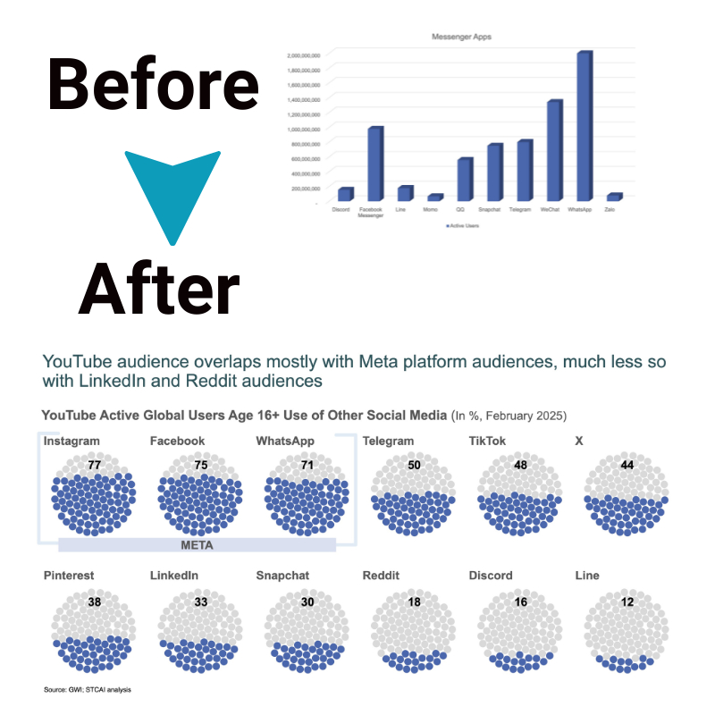
To improve data storytelling in presentations, it is important to use the right chart for your data and ensure legibility by choosing appropriate font sizes and color contrasts. Additionally, keeping your visualizations simple and highlighting important information will help engage your audience and make your message clear.
Customize your visuals to match the theme or purpose of your presentation, while also ensuring accessibility for all viewers.
Use the right chart
Choosing the right chart is key when presenting data. It helps convey information accurately and effectively to your audience. By selecting the appropriate chart type, you can enhance comprehension and make your data more visually appealing.
For example, if you have categorical data that you want to compare, a bar chart or a pie chart would be suitable options. On the other hand, if you want to show trends over time or relationships between variables, a line graph or scatter plot would be more appropriate.
Understanding the purpose of your data presentation and considering the nature of your data will guide you in choosing the most fitting chart for optimal communication impact.
It’s important to ensure that your data visualizations are legible and easy to read. Use clear fonts and avoid using too many colors or fancy formatting that might distract from the main message of your presentation.
Consider factors such as font size, axis labels, and legends so that all elements are easily discernible by both large and small audiences.
- Keep it simple
Simplicity is key when it comes to effective data presentations. Avoid cluttering charts with unnecessary details or overwhelming visuals. Stick to what’s essential for telling your story with data – focus on highlighting key findings and insights while removing any extraneous information that may confuse or distract viewers.
- Highlight important information
To draw attention to critical points in your presentation, use visual cues such as color coding or annotations within charts. This allows viewers’ eyes to quickly identify relevant information without having to analyze every aspect of the visualization.
- Customize your visuals
Check for legibility
When creating data presentations, it is important to check for legibility. This means ensuring that the text and visuals are easy to read and understand. Use clear fonts, such as Arial or Helvetica, in a size that can be easily seen from a distance.
Make sure there is enough contrast between the text and background color so that it stands out clearly. Avoid using overly decorative fonts or colors that may make it difficult for the audience to read the information.
Legibility plays a crucial role in effectively communicating your message and engaging your audience with your data presentation.
Keep it simple
When presenting data, it’s important to keep things simple. Avoid overwhelming your audience with complex charts or too much information. Instead, focus on presenting the key findings and insights in a clear and concise manner.
Use easy-to-understand visuals and language that everyone can follow. By keeping it simple, you’ll make it easier for your audience to grasp the main points and understand the story you’re trying to tell with the data.
So remember, simplicity is key when presenting data effectively.
Highlight important information
When presenting data, it is essential to highlight the most important information. This helps the audience focus on key insights and take away the main message you want to convey. By emphasizing crucial data points, trends, or findings, you can guide your audience’s attention and ensure they grasp the significance of your data story.
Use visual cues such as bold colors or larger font sizes to make important information stand out. Additionally, consider using callouts or annotations to draw attention to specific details that support your narrative.
These techniques help create a clear and impactful presentation that leaves a lasting impression on your audience.
Customize your visuals
When creating data presentations, it is important to customize your visuals to effectively convey information. This involves choosing the right colors, fonts, and styles that best represent your data and align with your overall message.
By customizing visuals, you can make your presentation more visually appealing and memorable for your audience. Additionally, you can use icons or images to further enhance understanding and engagement.
Customization allows you to create a unique visual experience that complements the storytelling aspect of your data presentation. Remember to keep the visuals simple and uncluttered so that they are easy for your audience to interpret and comprehend.
Ensure accessibility
To ensure accessibility in data presentations, it’s important to make sure that the information can be easily understood by all audience members. This means using clear and legible fonts, avoiding overly complicated charts or visuals, and providing alternative formats for individuals with visual impairments.
By considering the needs of all users, you can ensure that your data presentation is accessible to a wide range of people.
Using Storytelling Techniques to Enhance Data Presentations
Learn how to choose the right words and colors, avoid clutter, make connections between data points, and effectively use graphs to enhance your data presentations. Take your audience on a compelling journey through your data story.
Choosing the right words and colors
To effectively communicate through data presentations, it’s important to choose the right words and colors. The words you use should be clear and easy for your audience to understand, avoiding unnecessary jargon or complex terms.
Use language that is concise and engaging, ensuring that your message is easily comprehensible. Additionally, selecting the right colors can enhance the visual impact of your data presentation.
Use contrasting colors to highlight important information and make it stand out against the background. This will help draw attention to key insights in your data and make them more memorable for your audience.
Avoiding clutter
In data storytelling, it’s important to avoid clutter in your presentations. Clutter can make it difficult for your audience to understand and interpret the data. To avoid clutter, keep your visuals simple and uncluttered.
Use only the necessary information and remove any unnecessary elements that might distract or confuse your audience.
Highlight the most important information by using colors or emphasizing certain data points. This will help your audience focus on what’s relevant and not get overwhelmed by a lot of unnecessary details.
When creating graphs or charts, choose the ones that best represent your data without overcrowding them with too many labels or lines. Keep it clean and easy to read.
Making connections between data points
To create a compelling data presentation, it is important to make connections between the different data points you have. This means finding relationships and patterns that exist within your data and highlighting them in your presentation.
By doing this, you can help your audience understand the story behind the data and draw meaningful insights from it. Making connections between data points allows you to show how one piece of information relates to another and how they all contribute to a larger narrative or conclusion.
It helps in creating a cohesive storyline that guides your audience through the presentation and enhances their understanding of the data.
Using audience-focused design
When creating data presentations, it is important to consider the needs and preferences of your audience. This means using an audience-focused design approach. By understanding who will be viewing your presentation, you can tailor the visuals and content to resonate with them.
One way to do this is by choosing colors, fonts, and graphics that appeal to your specific audience. Additionally, organizing the information in a logical and intuitive manner can help ensure that your message is easily understood.
Remember to use clear and concise language that avoids jargon or technical terms whenever possible. By putting your audience at the forefront of your design decisions, you can create more impactful and engaging data presentations.
Differentiating insights and calls to action
Differentiating insights and calls to action is an important aspect of data storytelling. When presenting data, it’s crucial to not only convey the findings and insights but also provide actionable steps for the audience.
By highlighting the key takeaways from the data analysis, you can help guide your audience towards specific actions or decisions. This could include recommending strategies based on the data, suggesting next steps, or proposing solutions to address any issues identified.
The goal is to empower your audience with valuable information and motivate them to take meaningful action based on the insights provided by the data.
Using graphs effectively to convey information
Graphs are a powerful tool for presenting data in a clear and understandable way. They can help convey information quickly and effectively. To use graphs effectively, it is important to choose the right type of graph that best represents the data you want to communicate.
Whether it’s a bar graph, line graph, or pie chart, each type has its own strengths and weaknesses.
It is also crucial to ensure that your graphs are easy to read. Make sure the labels on the graph are clear and legible, and avoid overcrowding with too much information. Keep your graphs simple by focusing on the key points you want to highlight.
When using graphs, remember to highlight any important information or trends within the data. You can use colors or annotations to draw attention to specific data points or patterns that support your story.
Transforming Dashboard Insights into a Compelling Story
To transform dashboard insights into a compelling story, it is crucial to avoid data overload and prioritize key findings. By tackling scope creep and highlighting crucial information, the audience will be more engaged and motivated to take action based on the data presented.
Avoiding data overload
When presenting data, it’s important to avoid overwhelming your audience with too much information. To prevent data overload, focus on prioritizing key findings and highlighting crucial information.
This will help keep the presentation focused and make it easier for your audience to understand the main points. Another way to avoid data overload is by tackling scope creep – stay focused on the specific insights you want to convey and avoid including unnecessary details or tangents.
By keeping your presentation concise and relevant, you can ensure that your audience stays engaged and can easily grasp the key messages from your data.
Prioritizing key findings
To create a compelling data story, it is important to prioritize the key findings. This means identifying the most important insights or takeaways from your data analysis and highlighting them in your presentation.
By prioritizing key findings, you can ensure that your audience understands the main points and doesn’t get overwhelmed with too much information. It also helps to keep your presentation focused and concise, allowing you to tell a more impactful story with your data.
So when crafting your data presentation, make sure to identify and prioritize the key findings that will truly make an impact on your audience.
Tackling scope creep
When presenting data, it’s important to avoid scope creep, which means staying focused on the main points and not including unnecessary information. This can be achieved by prioritizing key findings and filtering out less important data.
By keeping the presentation concise and to-the-point, you can ensure that your audience stays engaged and understands the story you are trying to convey through your data. Avoiding scope creep allows you to highlight crucial information effectively and keep the audience’s attention on what really matters.
Highlighting crucial information
When presenting data, it is important to highlight the most important information. This helps your audience focus on key insights and take away the main message of your presentation.
By emphasizing crucial information, you can ensure that your audience understands the significance of the data and its implications. This can be done through visual cues such as using bold colors or larger fonts for important data points, or by verbally explaining and summarizing key findings throughout your presentation.
By highlighting crucial information, you make it easier for your audience to grasp the main takeaways from your data presentation.
Conclusion
In conclusion, mastering the art of data storytelling can take your presentations to the next level. By using the right charts, simplifying visuals, and highlighting important information, you can create compelling narratives that captivate your audience.
Remember to choose words and colors wisely, avoid clutter, and make connections between data points. With these techniques in place, you’ll be able to transform dry data into a powerful story that motivates action and delivers impactful insights.
So start harnessing the power of storytelling with data today and unlock new levels of communication success!
FAQs
1. What does it mean to take my data presentations to the next level with ‘Storytelling with Data’?
This means using your data presentation techniques in a way that helps craft a story and visualize insights from the data, making it more engaging and easy for others to understand.
2. How can storytelling with data be used effectively?
Storytelling with data is an effective communication tool when you create compelling narratives that motivate audiences; it makes numbers from your data interpretation relatable and memorable.
3. Can anyone use ‘Storytelling with Data’?
Yes! Anyone who wants better ways of doing their data communication or datadriven storytelling could benefit greatly from this method. It’s commonly applied in areas like business or even journalism!
4. Are there examples of how Storytelling with Data works?
For sure! You would find many useful examples of how others have told their stories using insights gotten from analyzing their facts and figures – these are typically referred to as ‘data storytelling examples’.


