Box Chart Mastery: The Complete Guide to Visualizing Data Distributions
When we think about data visualization, we often consider bar charts, pie charts, and even scatter charts, but what about box charts? Do these automatically come to your mind? If not, they should, and this guide is about to change all of that. What you’ll realize is that box charts have more than their place in the data visualization field, and they’re an excellent way to display large amounts of information in a clear and innovative way to your audience.
So, let’s dive in and learn everything there is to know about the humble box chart. From utilizing them in your PowerPoint infographics to customizing them to your specific needs, you might just want to use them in your next presentation.
Table of Contents
- Understanding Box Chart Fundamentals
- Comparative Box Chart Analysis
- Creating Effective Box Charts: Tools and Techniques
- Box Charts in Storytelling and Communication
- Box Charts for Specific Domains
- Common Pitfalls and Methodological Considerations
- Future Directions and Emerging Trends
TL;DR
- Box charts (also known as box plots) visualize data distribution using five-number summaries – minimum, Q1, median, Q3, and maximum.
- These charts are useful for identifying outliers, skewness, and spread within datasets.
- Comparative box charts allow easy visual comparison between several groups or categories.
- Tools like Excel, Python, and Storytelling With Charts support creating customizable box charts.
- Design choices, such as labeling, scale consistency, and annotation, can improve clarity and insights.
- Box charts play a powerful role in storytelling by highlighting trends, variability, and anomalies in a compact format.
- Common pitfalls include misinterpreting outliers, using inappropriate scales or axis truncation, and ignoring sample sizes.
- Future trends include integration with interactive dashboards, augmented analytics, and combining with other plot types for deeper insights.
Understanding Box Chart Fundamentals
You’ll often hear box charts called by different names, including box plots and box and whisker diagrams. Despite the name, their purpose is the same – to visualize data and reveal complete data distributions rather than just averages. These are a step up from simpler charts, and they can display several statistical markers at the same time. As a result, they’re excellent for comparing distributions across time periods or categories while highlighting variability patterns and outliers.
It’s interesting to learn where box-plot diagrams came from, and they originated in the 1970s, discovered by John Tukey, a statistician who used these charts when visualizing distribution characteristics without making any assumptions about their underlying statistical properties. It sounds complicated, but Tukey realized that outliers cannot distort a box chart, so they’re very valuable for skewed data sets. Since then, box charts have been commonly used in financial contexts, as well as biological and environmental research.
Anatomy of a Box Chart
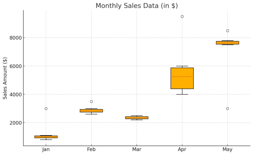
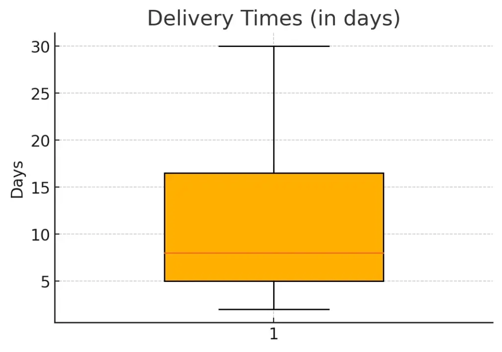
Box charts have five main statistical markers that work together to give a clear view of data. These are the minimum, first quartile (Q1), median, third quartile (Q3), and maximum values. It’s also possible to take box charts to another level by including mean indicators, confidence intervals, or data point overlays.
The Box: Interquartile Range (IQR)
A key part of box-and-whisker plots is the rectangular box that represents the middle 50% of the data, spanning from the first quartile to the third quartile. This is known as the IQR, or interquartile range, and it gives a huge amount of insight into the data spread. For instance, a tall box shows widely dispersed data. A compact box shows data clusters tightly around the median.
To calculate the IQR, arrange your data in ascending order, then find the Q1, which is the median of the lower half, and Q3, the median of the upper half. Then, subtract Q3 – Q1. The IQR is a strong measure of statistical dispersion because it’s not affected by any outliers or extreme values.
The Median Line
The median line is the horizontal line dividing the box. The position within the box shows the distribution skewness. The median line crosses at the bottom, showing positive skewness, or right-tailed. Positioning at the top shows negative skewness, or left-tailed.
When creating data visualizations, the median line is crucial in many charts, so choosing the right chart for your data is vital. Our article on this gives some valuable insights.
Whiskers and Fence Calculations
The box and whisker name comes from the ‘whiskers’ that appear to extend from the box. These represent data within a reasonable range, often calculated as 1.5 x IQR from the quartiles. There are upper and lower whiskers and these are calculated differently. The upper whisker goes from Q3 to the largest data point within that quartile, while the lower whisker goes from Q1 to the smallest data point within that quartile. These are useful boundaries to help spot any potential outliers.
Beyond the Basics: Interpretive Power
Box charts are highly valuable analytical tools because they can compress complex information into an easily comparable format. If you can learn to read these cues, you’ll notice deep insights about patterns that you might otherwise miss.
Distributional Shape Analysis
The positive thing about box charts is that they show distribution shapes that regular statistics might miss. Symmetrical distributions usually show equal whisker lengths and a centered median. Distributions that are right-skewed usually have longer upper whiskers and a median close to Q1. In a left-skewed distribution, there are longer lower whiskers with the median near Q3. Understanding these shapes is key in understanding data patterns that can affect decision-making or overall analysis.
In fact, our article on interpreting scatter plots and assessing variable relationships may yield some interesting insights.
Outlier Identification and Treatment
Points shown individually beyond the whiskers show possible outliers. These are values that fall outside the expected range. These aren’t errors, but they may show legitimate extreme values or show data collection issues. When you come across these, it’s important to check their accuracy and then investigate what caused them. This will help you decide whether to include or exclude them.
Comparative Box Chart Analysis
Box plots show their true power when you use them to compare different distributions side by side. This will give you visual insights into their similarities and differences across a range of measurements, such as time, demographics, or categories. Overall, box charts take abstract concepts and turn them into easily visible patterns that even someone with little technical knowledge can understand.
Side-by-Side Comparison Technique
If you are arranging several box charts for comparison, it’s a good idea to make careful design choices. This can boost their clarity and help you tell your story in a more engaging and transparent way. You can choose between grouped, faceted, and stacked arrangements of multiple bar charts, and this depends on the comparative questions you want to answer. However, it’s vital to have consistent scales across all charts.
Horizontal vs. Vertical Orientation
Box plots can be vertical or horizontal and both options have their own advantages. A vertical box chart has its categories on the x axis and works best when you have less than 10 groups or when category labels are quite short. On the other hand, horizontal charts are ideal for longer category names or when you’re trying to display several groups at the same time. Our article on the best practices for data-driven storytelling with charts gives some useful tips on how to make this decision.
Color and Pattern Strategies
Careful use of color can boost the quality of your box charts without them becoming a mess. Remember to use color consistency to represent specific categories or groups. Remember, your first priority should be clarity, not decoration.
Statistical Significance and Box Charts
Box and whisker charts are useful for rich visual comparisons, but they’re not ideal for indicating whether the differences you notice are statistically significant. That’s why integrating statistical testing with box charts gives you a deeper picture and helps your audience understand the differences more clearly.
Notched Box Plots
Using a notched box plot can add confidence intervals around the median, so it creates a notch in the box. The width is usually calculated as ±1.58 × IQR/√n) and gives a 95% confidence interval around the median itself.
Overlay Methods for Significance
In some cases, notched plots might not be the best way forward, for instance, if you’re presenting information to an audience who aren’t that au fait with statistics. An alternative is to add brackets with asterisks above groups that are significantly different, as they would do in scientific publications. Another option is to overlay the p-values between relevant comparisons, or you could make it even simpler and use color coding to highlight important differences.
Creating Effective Box Charts: Tools and Techniques
To create an effective box and whisker chart, you need a little technical skill and design know-how. However, the right tools can take raw data and turn it into a story that highlights key insights and keeps the integrity of your statistics in place. Of course, it’s vital to understand your audience and how they comprehend data patterns, as we discuss in our article on essential graphs and charts for beginners.
Software-Specific Implementation
There are several platforms you can use to create box charts, and they all have their pros and cons. It’s important to take your time and analyze each one carefully, so you can be sure you’ve made the right decision from the start. For instance, our free PowerPoint plugin helps you create and customize charts with ease. Let’s take a look at some of the most common options so you have the full picture.
Spreadsheet Applications
Here, we’re talking about programs such as Excel and Google Sheets. These are relatively simple options that don’t require any knowledge of coding. However, to create box charts using these, you often have to use workarounds as they’re not designed to create box plots natively. In Excel, you can use the stock chart type with high-low-close data to create a box and whiskers plot. You would then use ‘high’ to represent Q3, ‘low’ for Q1, and ‘close’ for the median. Our article on visualizing data in Excel gives some extra techniques and workarounds.
Programming Solutions
This refers to R and Python, and these offer flexible methods for creating box charts. When using R, you can choose the boxplot function from NAS graphics. If you’re using Python, you can use matplotlib’s boxplot.
Box Charts in Storytelling and Communication
When looking to tell a story with your data, you’ll find that box charts are a good way to do just that. However, they need careful presentation to boost their overall impact and make it easier for your audience to understand your message. This means careful consideration of what your audience needs, the narrative structure, and overall context. Our article on how to communicate quantitative analysis effectively gives some useful advice.
Tailoring Box Charts to Different Audiences
Two audiences may interpret your box chart completely differently from one another, so it’s vital to consider your audience’s expertise and level of statistical literacy. From there, adapt your presentation to their needs to ensure your message is conveyed accurately and clearly. In the end, you don’t want to overwhelm your audience.
The first step is to focus on analysis before design, and keep visual complexity in line with their expertise. You can opt for a simpler presentation for a general audience and go more in depth for a technical audience. Also remember to keep an eye on the language you use in your titles and annotations. Avoid using technical jargon for audiences who may not understand what you’re referring to.
Interactive Engagement Strategies
Interactive box charts are a useful tool that can turn even the most passive of audience members into keen explorers. Within this, progressive disclosure techniques can be game changers to build suspense and excitement, via hover or click actions on demand. Ultimately, this is also a good method to prevent cognitive overload and guides your audience through your analytics in a more innovative way.
Narrative Integration Techniques
You can make your box and whisker diagram even more life-like if you add a narrative that pulls together your statistics. This can help take abstract data distributions and turn them into stories that are not only understandable but that grab attention and drive action. A suggested narrative pattern includes context setting, pattern identification, implication explanation, and recommended actions.
Visual Hierarchy and Emphasis
It’s vital to pay attention to the most important insights you want to convey and then arrange them into a visual hierarchy that draws attention where you want it to be. You can use color here, especially to highlight comparison groups while keeping others pushed a little to the background. Annotations can also help you state critical findings clearly within the visualization, rather than leaving them open to interpretation. Our guide to using data visualization annotations and labels effectively will help you here.
h2 id=”common-pitfalls”>Common Pitfalls and Methodological ConsiderationsA box and whisker plot is certainly a powerful tool to have in your data visualization armory, but there are some common pitfalls to be aware of to ensure you get your message across not only clearly, but also accurately. Most common missteps result from unfamiliarity with and complex statistical concepts, rather than the actual type of chart itself.
Sample Size Sensitivity
Box charts pull their statistics from sample data so they’re very vulnerable to variability that affects reliability and value. In smaller datasets, the risk is even greater, because quartile estimates are often unstable and it may be harder to spot outliers.
Minimum Viable Sample Thresholds
The reliability of statistics within box charts reduces with smaller sample sizes. There isn’t universal threshold in existence, but distributions with less than 20 points usually produce unstable estimates. If you have a sample of less than ten, the range becomes quite unreliable and outlier detection may show legitimate values as incorrect. To avoid this, consider alternative charts, such as dot plots, when working with limited data. You could also use bootstrap resampling techniques to build more confidence intervals in your box plot.
Unequal Sample Size Considerations
When using a box chart to compare groups with hugely different sample sizes, there is a risk of disparity. This risk can be reduced by using variable-width boxes proportional to the square root of the sample size. It visually signals reliability differences. You could also supplement with explicit confidence intervals around the medians or add sample size annotation to prevent any misleading comparisons.
Future Directions and Emerging Trends
As technology and data sensitivity expands, so does the box chart methodology. These new innovations aim to increase the capabilities of these charts while addressing traditional limitations.

Source: Unsplash.com
Algorithmic and Computational Advancements
Computational improvements signal great promise for how box charts may look and work in the future. Of course, algorithms are also powerful tools that we hear about in many other spheres. Both of these technological innovations can help to support dynamic analytical workflows and boost statistical enhancements and reliability with smaller sample sizes. Additionally, integration with machine learning techniques may help box charts visualize predicted distributions by using historical data.
Aesthetic and Perceptual Innovations
The visual design of future box charts also looks set to change for the better. New innovations in visual design will help audiences gain insights out of the story more efficiently while also maintaining the integrity of statistics. All of this helps to boost information absorption while minimizing the amount of cognitive load on each member of your audience.
Gradient and Texture Enhancements
Boosting the visual appeal of a box and whisker chart can be done with color currently, but texture patterns give another option that can help to enhance dimension. This will be especially useful for accessibility reasons, when color differentiation may be challenging for some members of your audience. Gradients can also help viewers visualize confidence in uncertainty, using saturated colors to show regions of higher certainty and fading colors where there is more uncertainty.
Learning Recap
We’ve talked a lot about box charts and what they can be used for, how to create them, their pros and cons, and how they may look in the future, and it’s clear that they’re a powerful tool for visualizing distributions. In particular, box-plot charts excel at comparing multiple groups and then showing the differences in trend, spread, and shape, details that may be missed by other types of charts or statistics. To create an effective box chart, it’s important to have the right tools, either spreadsheet techniques or programming libraries, and to consider different elements that suit your audience best. This includes orientation, color, and visual enhancements. You should also remember to tailor language and complexity to your audience’s level of understanding, to avoid cognitive overload and confusion.
At Storytelling With Charts, we don’t believe that data visualization should be expensive or complicated. To that aim, we created a free PowerPoint plugin to help you create a range of chart types and customize them to your specific needs. It’s easy, intuitive, smooth, and you don’t need a college diploma to use it. As for fees – there are none. We just simply believe that everyone should have access to quality tools without spending a small fortune, and that includes our range of resources on our website, designed to make data visualization more accessible. Our article on how to create PowerPoint presentations quickly is a great starting point.
All you need to do is head to our website, download our plugin, install it, and get started on your storytelling journey, whether that’s with box charts or a completely different option that suits your needs best.