
Data Storytelling Made Simple: The Ultimate Guide to Excel Charts
Graphical data representation is what Excel charts are all about. It offers the chance to use data visualization to captivate the audience with a gripping narrative. However, choosing the wrong chart types can create obstacles while creating a compelling narrative.
So, knowing only the types of Excel charts isn’t enough, as data storytelling via Excel graphs requires more skills and insightful tips. This is exactly what you’ll learn in this article: the best way to use Excel charts to simplify data storytelling and take your data visualization game to the next level. Before we start, let’s quickly look at the different chart types available in Excel.
Charts types in Excel
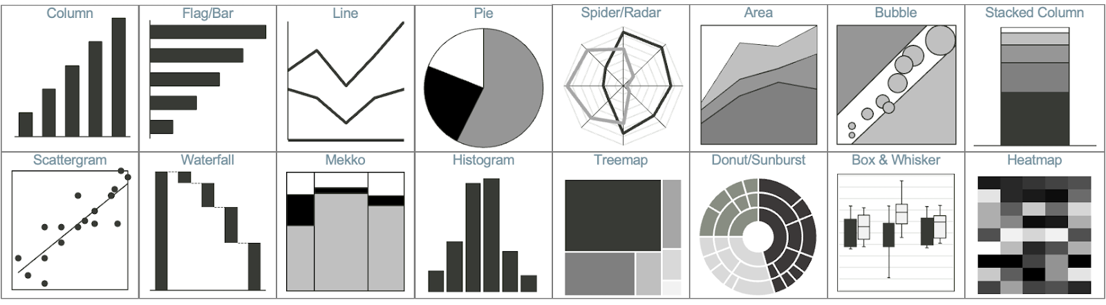
The Charts command group in Excel contains many chart options, but different charts better represent different types of information. An icon representing your chart’s result appears next to each chart choice in the Charts command group. You may see the name of the chart and an indication of when to use it by briefly hovering your cursor over each icon.
- The kind of chart you select will be determined by
- Type of information you’re providing.
- The kind of story you are attempting to convey.
- Group of people you are presenting to.
Ways to use Excel charts to improve data storytelling:
You are now proficient at using Excel to produce charts and graphs. It is not, however, the conclusion of the tale. The goal of data visualization is to effectively communicate the intended meaning of the data to the viewer, not only to arrange multiple graphs pleasingly.
These pointers will enable you to develop your abilities in data storytelling:
Let things be simple
The best practice for data storytelling is still to “keep it simple.” Make your Excel charts and graphs as simple as you can at all times. Keep in mind that the reader should easily understand the information on your chart. Don’t overcomplicate your charts with too many data points or complex designs. Focus on highlighting the key trends and relationships in a clean, minimalist style.
Think about your audience and what insights they need to grasp quickly. Simple, well-designed charts allow the data itself to shine through clearly. Follow the principles of good visual design to create an intuitive flow for the viewer’s eye to follow.
Pick the right chart
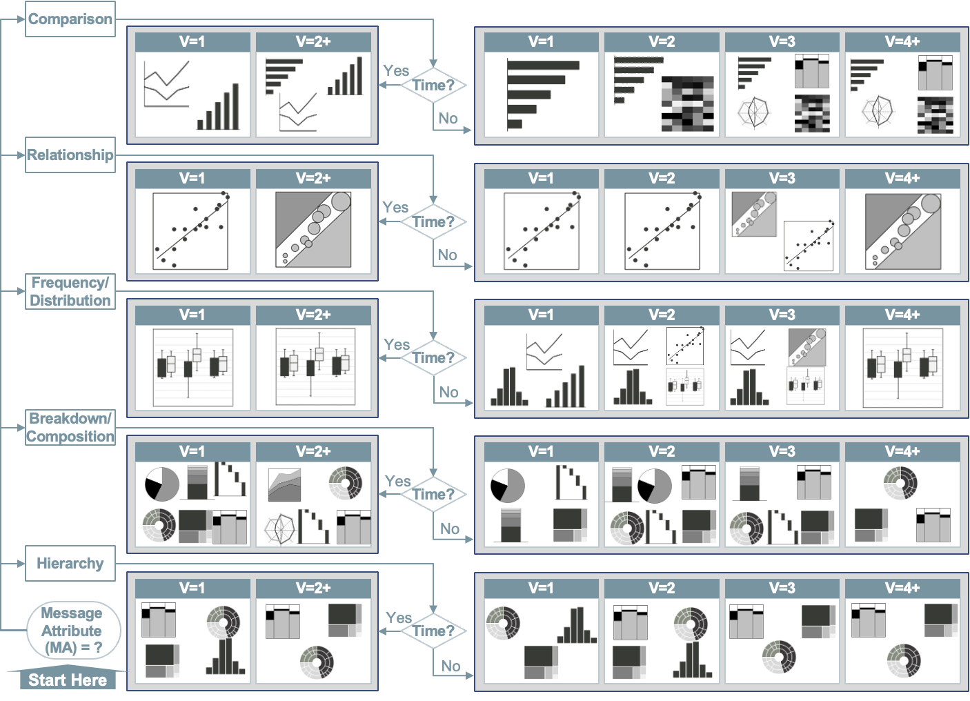
Learn the primary distinctions between the different kinds of charts, including pie charts, line charts, and bar charts, among others. Discover which chart type has certain benefits and drawbacks. You will be able to select the best kind of graph for your needs if you have this basic understanding. Each chart type has strengths and weaknesses for showing certain types of data.
Consider if you want to highlight trends over time, comparisons between categories, parts of a whole, or correlations. Make sure the chart suits the story you want to tell. While a pie chart may look nice, a bar chart could better highlight key differences. Think about what insights you want viewers to grasp at a glance.
Make your graphs and charts as interactive as possible
Excel graph tools may be made lively and captivating for your audience by incorporating interactivity. Interactive components boost user comprehension and engagement by enabling users to explore the data actively. Users can selectively examine particular data subsets by using filters.
Buttons can initiate operations like data refresh or chart updates and slicers provide an easy-to-use method of filtering data. Animating graphics and updating data sources are only two examples of complex operations that macros may automate.
It is imperative to thoroughly evaluate and resolve issues with your creations before integrating interactivity. Verify that every feature works as it should, considering compatibility with various Excel versions and evaluating how complicated interactivity affects performance.
Label data properly
Data labeling plays a key role in improving data storytelling and making it more powerful. For example, one can start labeling your chart’s axes and primary data categories. However, if you overdo data labeling on your chart, it may distract your viewers.
When adding labels, focus on essential information that conveys your key data stories. Labels for secondary data categories or intricate details may contribute little additional value and could make your chart overly complex. Stick to concise, clear labels that draw attention to the most meaningful parts of your data narrative. Prioritize labels that orient the viewer and enhance comprehension.
Integrate multiple graphs and charts into a single dashboard
Another effective way to deliver a well-curated overview of the data to the audience is by strategically combining several charts and graphs into an Excel dashboard. Contemplate your data as a puzzle, with the dashboard as the last piece connecting everything.
But how does one create a dynamic dashboard? It’s simple: just use tools like pivot tables, sparklines, and interactive charts. Pivot tables are useful for summarizing data, pivot charts allow for interactive exploration, and sparklines allow you to see trends inside cells.
Now, when creating a dashboard layout in Excel to improve data storytelling, ensure considering the logical flow of information. Assemble comparable graphs and charts in a way that best communicates the data. Try identifying the insights precisely before placing them and direct the viewer’s attention by making the most of headings and labels.
However, try not to overdo conditional formatting. This can make your charts look clumsy and confusing to all viewers. As mentioned before, go for the minimal use of the chart maker and keep things simple. Highlight the important facts and details to ensure your message is loud and clear.
Use color effectively to highlight key information.
Colors can be a great way to direct your audience’s eyes toward the most significant parts of your charts. Say you have a column chart showing sales data across regions. Rather than plain blue columns throughout, consider highlighting the region with the highest sales in vibrant red. This draws focus to the best-performing region. Similarly, muted grays could de-emphasize underperforming regions.
Ensure consistency in design across all charts.
Maintaining a cohesive “look” across your data charts creates a more professional, credible data story. Using identical fonts, background colors, and data label positions across charts helps audiences grasp your data narratives easily. For instance, you may showcase profit trend lines across products in one chart and sales growth % in another – but keeping the core design aspects the same reinforces the unified stories in the data.
Improve data storytelling with Excel charts today!
Excel charts for data storytelling have emerged as a simple, fast, and engaging way of transforming real-time data into insightful understandings. So, make the most of this comprehensive Excel graph and chart tips to level up your data visualization skills and connect at a deeper level with your viewers.