Enhancing Data Narratives: Incorporating Pie Charts in Visual Storytelling
Data can often feel overwhelming, making it a challenge to tell captivating stories. Did you know that pie charts, when used correctly, enhance data storytelling by simplifying complex information? In this blog post, we’ll guide you on how to incorporate pie charts into your data narratives effectively.
Prepare to transform numbers into compelling visual tales that capture and keep your audience’s attention.
The Importance of Data Storytelling and Pie Charts
Data storytelling is a powerful way to communicate data insights and engage audiences, and incorporating pie charts can greatly enhance the effectiveness of these narratives.
Explain the concept of data storytelling
Data storytelling is a way to share details using data. We use words, numbers, and visuals to tell the story. In this story, the facts come from data. We show these facts in charts or graphs.
It helps people understand complex ideas easily. They can make better choices based on these stories.
Highlight the benefits of incorporating pie charts in data storytelling
Pie charts are a useful tool for data storytelling because they make it easy to understand and interpret information. One of the main benefits is their ability to show proportions and percentages in a clear and visually appealing way.
They use different colors or patterns to represent different categories, making it easy to compare and analyze data at a glance. Pie charts also help simplify complex data by breaking it down into smaller, more digestible parts.
This makes it easier for the audience to grasp the main points and take away key insights from the data narrative. By incorporating pie charts into your visual storytelling, you can enhance engagement, improve comprehension, and effectively convey your message using simple yet impactful visuals.
Elements of Effective Data Storytelling
Relevance and context, quality and accuracy of data, clear narrative structure, and intentional use of visuals are all important elements to consider in effective data storytelling.
Relevance and context
Relevance and context are crucial elements in data storytelling. It’s important to understand the purpose of your narrative and who your audience is. By considering these factors, you can determine what information is relevant and how to present it in a way that will resonate with your audience.
Context provides background information that helps readers understand the significance of the data and its implications. Ensuring relevance and context in your data narratives allows for clearer communication and better engagement with your audience.
Quality and accuracy of data
To tell a compelling data story, it is crucial to ensure the quality and accuracy of the data you are using. This means double-checking your sources and verifying that the information you present is reliable.
By doing so, you can build trust with your audience and make sure that your narrative is based on solid evidence. Additionally, taking the time to clean and organize your data will help prevent errors and inconsistencies in your storytelling process.
Remember, accurate data leads to more meaningful insights and a stronger connection with your audience.
Clear narrative structure
A clear narrative structure is an important element of effective data storytelling. It helps to organize and present information in a logical and engaging way. By having a clear beginning, middle, and end, the audience can easily understand the story being told through the data.
This structure also helps to guide the flow of information and ensure that key insights are effectively communicated. Using headings or sections can further enhance clarity by separating different parts of the narrative.
With a clear narrative structure, data stories become more cohesive and easier for audiences to follow and comprehend.
Intentional use of visuals, including pie charts
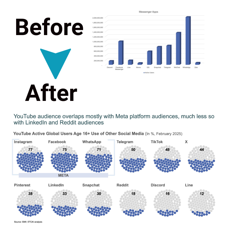
Using visuals, like pie charts, in data storytelling is an intentional choice that can enhance the effectiveness of your narrative. Pie charts are a type of graph that display data as slices of a circle, where each slice represents a different category or part of a whole.
By visually representing data in this way, you can easily show the distribution and proportions of different elements within your story. This allows your audience to quickly grasp key insights and understand the significance of the numbers you are presenting.
When used intentionally and appropriately, pie charts can add clarity and impact to your data narrative by simplifying complex information into digestible visual representations.
Steps to Enhancing Data Narratives with Pie Charts
Choose the right data, narrative structure, and visual elements such as pie charts to create compelling and impactful data stories. Find out how in this informative blog post.
Understand your audience and purpose
To enhance your data narratives with pie charts, it is important to understand your audience and purpose. Knowing who will be reading or viewing your data story helps you tailor the narrative and choose the right visuals, including pie charts, that will resonate with them.
Consider their level of knowledge and expertise in the subject matter, as well as their specific interests and needs. Additionally, clarify your purpose for creating the data narrative – whether it’s to inform, persuade, or entertain.
By understanding your audience and purpose, you can create a more effective and engaging data story that effectively communicates insights through pie charts and other visual elements.
Choose a narrative structure
To enhance data narratives, it’s important to choose the right narrative structure. This means deciding how you want to tell your story using the data. You could use a chronological structure, where you present the data in the order that events occurred.
Or you could use a problem-solution structure, where you introduce a problem and then show how the data helps solve it. Another option is a compare-contrast structure, where you highlight differences or similarities in the data.
Whatever structure you choose, make sure it aligns with your audience and purpose so that your message is clear and engaging.
Select the right data and visual elements, including pie charts
To enhance data narratives, it is crucial to select the appropriate data and visual elements, such as pie charts. When choosing data, consider its relevance to the narrative and the audience’s needs.
The information should be accurate and of high quality for effective storytelling. In terms of visuals, including pie charts can help convey distribution or percentages in a clear and concise manner.
By selecting the right data and visual elements, you can create compelling narratives that enable easy understanding and engagement with your audience.
Add context and annotations
To enhance data narratives with pie charts, it is important to provide context and annotations. Context helps the audience understand the purpose of the data, while annotations provide additional information about specific data points or trends.
By adding context, such as explaining the time frame or comparing different categories, you can help your audience make sense of the data presented in the pie chart. Annotations can be used to highlight key insights or explain any outliers or unusual patterns observed in the chart.
These additions ensure that your data storytelling is clear and informative for your audience.
Incorporate interactivity and feedback
To enhance data narratives and engage your audience, it is important to incorporate interactivity and feedback. This allows viewers to interact with the visual presentation and actively participate in the storytelling process.
By adding interactive elements such as tooltips, filters, or drill-down capabilities, you can provide more detailed information that caters to individual interests. Additionally, incorporating feedback mechanisms like surveys or quizzes allows you to gather insights from your audience and adjust your narrative accordingly.
Ultimately, interactivity and feedback make data storytelling more engaging, personalized, and impactful.
Conclusion
Incorporating pie charts in visual storytelling can greatly enhance data narratives. By using these simple and easy-to-understand visuals, we can effectively communicate complex information to a wide audience.
So next time you’re creating a data narrative, remember the power of pie charts in telling your story accurately and engagingly!
FAQs
1. What does “Enhancing Data Narratives: Incorporating Pie Charts in Visual Storytelling” mean?
It means using pie charts and other data visualization techniques like bar charts, histograms, and scatter plots to tell a story with data.
2. How can pie charts enhance data narratives?
Pie charts help in visual communication of information by showing data representation in a simple and clear way that anyone can understand.
3. Are there other ways to present data besides pie charts?
Yes! You can use bar charts, scatter plots, histograms along with infographics for effective data presentation.
4. Why is storytelling important in data analysis?
Storytelling techniques make it easier for people to interpret the outcomes of Data Analysis by turning complex information into understandable narratives.
5. What is the role of infographics in visual storytelling?
Infographics are part of Information design; they combine visuals and text to make understanding complex details from Data Journalism easier.


