Enhancing Data Visualization: The Power of Bubble Charts

Introduction
In the world of data visualization, there are numerous techniques to effectively communicate information. One such technique that has gained popularity in recent years is the bubble chart. In this article, we will delve into the intricacies of bubble charts, exploring their purpose, benefits, and how they can be leveraged to convey complex data in an engaging and intuitive manner.
Understanding Bubble Charts
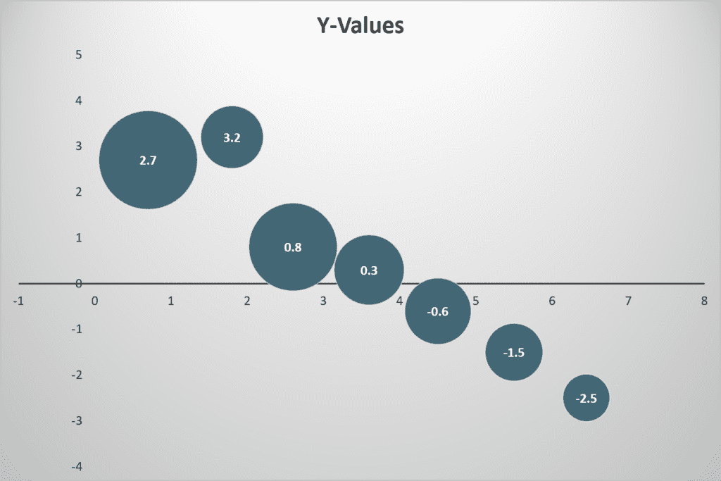
A bubble chart is a type of chart that displays three dimensions of data points: the x-axis, the y-axis, and the size of the bubble itself. Each bubble represents a data point, where the x and y coordinates denote two variables, and the size of the bubble reflects a third variable. By visualizing this multidimensional data, this type of chart offers a unique way to uncover patterns, relationships, and outliers within datasets.
Advantages of Bubble Charts
1. Visualizing Multivariate Data
Bubble charts are particularly useful when dealing with datasets that contain multiple variables. Unlike traditional scatter plots that only represent two dimensions, bubble charts add a third dimension through the size of the bubbles. This additional dimension allows for the representation of complex relationships and trends that might be missed in simpler charts.
2. Highlighting Differences in Magnitude
The size of each bubble in a chart can be used to represent the magnitude of a specific variable. This enables viewers to quickly compare and contrast different data points based on their relative sizes. Using visual cues, these charts make it easier to identify significant differences and outliers in the data, leading to better insights and decision-making.
3. Encouraging Interactivity
Bubble charts can be made interactive, allowing users to explore the data more engagingly. By incorporating features such as tooltips or hover effects, viewers can access additional information about each data point by simply interacting with the chart. This interactivity promotes a deeper understanding of the underlying data and encourages users to explore various angles and perspectives.
Use Cases for Bubble Charts
Bubble charts find applications in a wide range of fields and industries. Here are a few notable examples:
Financial Analysis
Bubble charts can be employed to analyze financial data, such as stock prices and market capitalization. By plotting different stocks on the chart, investors can quickly identify companies with similar performance metrics or spot outliers that require further investigation.
Social Sciences
In social sciences, bubble charts can help illustrate relationships between variables. For instance, a researcher studying education could use a bubble chart to visualize the relationship between student enrollment, education spending, and test scores across different schools or regions.
Product Development
Bubble charts can aid product development teams in prioritizing features or assessing customer feedback. By mapping user satisfaction ratings, development efforts, and potential revenue impact, teams can make informed decisions on feature enhancements or bug fixes.
Tips for Creating Effective Bubble Charts
To maximize the impact of your charts and ensure they resonate with your audience, consider the following guidelines:
- Choose Appropriate Scaling: Pay attention to the scaling of both the x and y axes to accurately represent the data. Improper scaling can distort the relationships between variables and lead to misinterpretation.
- Use Clear Labels: Clearly label each bubble to provide context and enable easy identification. Avoid cluttering the chart with excessive labels, opting for a clean and uncluttered design instead.
- Color and Contrast: Utilize color and contrast effectively to distinguish different categories or groups within the data. This visual distinction aids comprehension and makes it easier to identify patterns or outliers.
- Consider Animation: If the dataset is large or complex, consider adding animation to reveal the data gradually. This technique can enhance storytelling and guide the viewer’s attention to specific elements.
Conclusion
Bubble charts offer a powerful means of visualizing multidimensional data, providing valuable insights, and facilitating data-driven decision-making. By understanding their advantages, exploring their use cases, and following best practices for their creation, you can harness their potential to create compelling and informative visualizations. Incorporate bubble charts into your data visualization arsenal and elevate the impact of your analyses and presentations.
Remember, effective data visualization is not just about the tool—it’s about the story you tell with your data. So, go ahead and experiment with these charts to unlock new perspectives and take your data storytelling to the next level.
Now that you have a solid understanding of bubble charts, it’s time to leverage this knowledge and outrank other articles on Google with your insightful content. Good luck in your pursuit of SEO success!
To learn more and purchase the book, visit StorytellingwithCharts.com. Unleash the true power of your data and communicate insights with clarity and impact using bubble charts.