How to Build an Engaging Data Presentation with Charts
In our world now, where data is very important, data presentation is essential to share complicated information effectively. Combining data with storytelling turns simple numbers into a narrative that your audience can connect with. A good method to create this combined effect is by using charts. We will discuss in the article how you can make a data presentation that captures attention through charts, making use of well-known software such as Excel and providing useful advice for improving your data storytelling skills.
Understanding the importance of data presentation
Before we explore the complexities of making charts, it is important to understand how crucial data presentation is. A presentation that is organized well helps people get information easily and supports them when they need to make choices. Data storytelling is like creating a narrative with your data. It puts a human feel on the numbers so people can understand and remember them better. While various complex chart types and design customization exist, it is critical to remember that impactful data presentation places the audience’s experience first. The overriding purpose is to create clarity from complexity, ensuring viewers comprehend the significance of patterns and trends.
Choosing the right chart maker
Choosing the right chart maker is important to make a good data presentation. Excel, which many people use for spreadsheets, has different kinds of charts you can use depending on your data. It offers a flexible space for showing your data, from basic bar graphs to complex radar charts. With a multitude of chart maker software and tools available, it is vital to strategically select the solution that empowers optimal visualization capabilities tailored to your data storytelling needs. The right platform offers diverse chart types highlighting various relationships and patterns inherent in the datasets, allowing customizable representations that speak directly to target audiences.
Excel chart basics
For beginners with Excel charts, it is important to learn the fundamental steps. First, choose the data area you want and then pick a type of chart that fits well. Bar graphs are good for showing the quantity of things you have, and circle graphs better show the parts of a whole thing. Line graphs are useful when you want to see how something changes over time. Experiment with different chart types to determine what you want to narrate best.
Mastering basic Excel chart proficiency requires grasping essential visualization principles. The platform offers flexibility to represent diverse data perspectives, from the comparison of categorical quantities with bar charts to part-to-whole analyses through pie charts or flowing time-based trends with line graphs.
Tips for creating impactful charts

- Simplify
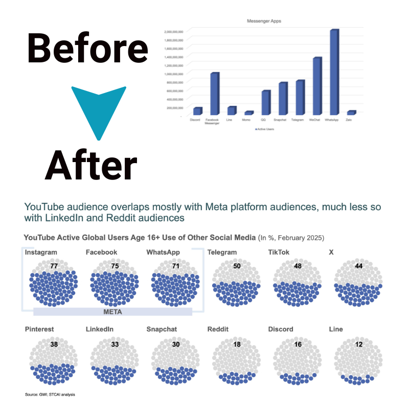
Audiences need more time and capacity to interpret elaborate charts. Therefore, the most effective approach is simplifying the data and showcasing only the most salient points, communicating the key takeaways. The charts should hone in on critical details and trends clearly. Keeping visualizations concise and comprehensible enables the main insights to stand out without diluting them across too much extraneous information.
- Use consistent color schemes.
A consistent color palette is recommended across all data visualization charts and graphs in a presentation. Using the same colors repeatedly to denote the same variables, metrics, categories, or timelines enables audiences to decipher the meanings intuitively. This builds recognition and speeds comprehension as viewers rapidly correlate colors with their contextual significance based on previous slides. In contrast, randomly changing color schemes are visually disjointed and force readers to reinterpret meanings. A coherent visual language should be established through the systematic use of color. Adhering to consistent colors and avoiding distracting contrasts creates flow and facilitates understanding of patterns in the data.
- Label clearly and concisely.
All visualization elements, including axis labels, chart titles, data point descriptors, and annotations, must employ clear, concise language to maximize comprehension. Lengthy or vague descriptions can obfuscate the key messages a chart aims to impart. Brevity and precision are optimal when labeling charts. For instance, the x and y axes should feature brief descriptors regarding the variables or units represented. Chart header text should plainly state the relationship or pattern depicted. Annotations can spotlight salient observations but should use succinct statements that directly accentuate the significance or conclusions to be drawn without excessive verbiage. Precise, unambiguous language allows visuals to speak volumes.
- Employ data visualization best practices.
Applying the fundamental best practices associated with each visualization method is vital for impactful data storytelling. Different data patterns and narrative objectives warrant corresponding chart types and techniques that optimize clarity. For instance, pie charts or stacked bars totaling 100% for proportional comparisons best convey part-to-whole relationships. Highlighting trends over time is ideally shown via time-series line graphs. Maximizing the suitability of visual constructs to match the underlying message is crucial. No single chart excels at everything; judiciously picking the right one makes data spring to life.
Understanding the core strengths and weaknesses of visualization lets you extract key insights and tell clearer data stories.
Advanced Excel chart features
Excel offers advanced features that can elevate your charts to the next level.
I. Dynamic charts with pivot table
- Create dynamic charts that update automatically when your underlying data changes.
- Pivot tables can assist in organizing and summarizing large datasets for charting purposes.
II. Combo charts for comprehensive insights
- Combine different chart types in a single visualization for a more comprehensive understanding.
- You can combine a line graph and a bar graph to display trends along with specific data values.
Incorporating data storytelling techniques
Now that you know how to make charts with technical skills, it is time to make your presentation better by telling a good narrative.
I. Start with a compelling narrative
- Introduce your data with a proper story to get the attention of your audience from the start.
- Try to make the data more relatable. To do this, frame the data within a real-world context.
II. Highlight key takeaways
- Identify and emphasize the most critical insights your data reveals.
- Use charts as visual anchors to support your key messages.
III. Guide your audience
- Lead your audience through the data journey, providing context and explanations as you go.
- Use charts strategically to reinforce your narrative at key points.
Conclusion
To be good at making data presentations with charts, you need to know the technical parts and also how to tell a story. Excel is a very useful tool for creating these kinds of charts because it has many options. When you follow the best methods, learn to use sophisticated features, and incorporate storytelling techniques, your data becomes an engaging story that catches your attention and passes the desired message to your audience.
On this journey of data presentation, keep in mind a good chart is more than a visual aid. It’s an effective way to tell stories, which can greatly improve how you communicate with others. Storytelling with Charts can be your trusted companion if you wish to know more about data presentation with charts.


